Checkbox
The Checkbox component is a UI element designed for binary selections. It consists of a small box that can be checked (selected) or unchecked (deselected) by the user.
The Checkbox component contains an embedded Checkbox Input and a Label element. This is of great importance as configuring the Checkbox component may require adjusting properties within the embedded elements. This applies to the visual style, triggers, and actions as they may differ.
Use Cases
The Checkbox component serve various purposes in user interfaces, including:
-
Feature Control: Enable/disable features.
-
Preference Indication: Reflect user preferences.
-
Agree/Disagree Choices: Obtain user consent.
Properties Customization
Checkbox Component
Enhance the Checkbox component to align with your application's requirements using the following customization options:
- Label Position: Developers can tailor the label's position, placing it above, below, to the left, to the right, or even hidden.
-
Variant Selection: Choose the variant that aligns with your design:
- Checkbox Variant: Select this for the standard checkbox style.
- Switch Variant: Choose this for a switch-like appearance.

- Checkbox Variant: Select this for the standard checkbox style.
-
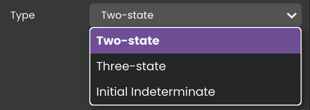
Checkbox Type selection: Choose between three checkbox configurations to determine the available states and default values for the checkbox:
- Two-State Checkbox (Default): Select this for straightforward binary decisions.
- Three-State Checkbox: Select this for scenarios requiring an optional or undefined state.
- Initial Indeterminate Checkbox: Select this to provide an indeterminate state initially, transitioning to two-state behavior after first use.
Type States Default Value State Transition Order Two-State Checkbox - Checked ( true): Option is selected.
- Unchecked (false): Option is rejected.false(unchecked)- Checked
- UncheckedThree-State Checkbox - Checked ( true): Option is selected.
- Unchecked (false): Option is rejected.
- Indeterminate (null): No action has been taken or optional.null(indeterminate)- Indeterminate
- Checked
- Unchecked
- IndeterminateInitial Indeterminate Checkbox - Checked ( true): Option is selected.
- Unchecked (false): Option is rejected.
- Indeterminate (null): Only before first user action.null(indeterminate)- Indeterminate (before first action only)
- Checked
- Unchecked - Two-State Checkbox (Default): Select this for straightforward binary decisions.
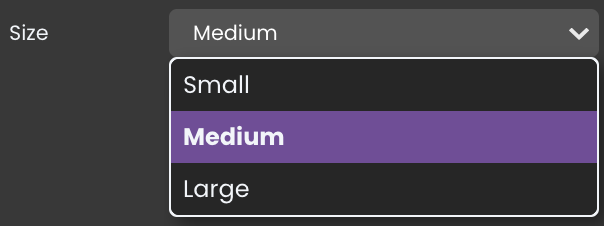
- Size: Choose from small, medium, or large sizes for the Checkbox component.
Embedded Label
Within the Checkbox component, an embedded Label allows for further customization of the following properties:
- Label: Personalize the label to offer clear instructions or guidance.
Data Integration
The Checkbox component allows for seamless integration of Qodly Sources, enabling dynamic data binding and interaction within the Page.
The qodlysource for the Checkbox component should be binary, with values limited to true or false.
Data Binding
To associate data with the Checkbox component, follow these steps:
-
Navigate to the Properties Panel: Access the Data Access category located within the Properties panel for the Checkbox component.
-
Define the Qodly Source: Specify the relevant qodlysource that will capture the user's selected choice.
Alternatively, you can establish the connection by dragging and dropping the qodlysource onto the Checkbox component.
Server-Side Interaction
Interacting with user input data is straightforward. When you bind a qodlysource to the Checkbox component, you can access and make use of the input content.
Subsequently, you can utilize this input value in various ways, such as within a standard action to initiate a search with matching attribute values.
Customizing CheckBox Styles
The Checkbox component offers additional customization options through CSS, providing control over the appearance of checkbox elements.
Component-Specific Classes
The following CSS classes are applied to various elements within the CheckBox component, defining their layout, style, and behavior. Each class can be customized to adjust the look and functionality of specific parts of the component.
| Class Name | Applies To | Description |
|---|---|---|
chakra-checkbox | CheckBox wrapper | Provides base styling for the CheckBox wrapper, including layout and positioning. |
chakra-checkbox__input | Checkbox input | Applies default styling for the actual checkbox input element, usually hidden to allow the control to display instead. |
fd-label | Label element | Styles the CheckBox label, including font size, color, and positioning relative to the checkbox input. |
Component-Specific Tags
The following HTML tags make up the structure of the CheckBox component. Each tag can be styled to adjust its appearance, alignment, and user interaction.
| Tag Name | Applies To | Description |
|---|---|---|
<input> | Checkbox input field | The main checkbox where users select or deselect options. Styling the input affects borders, padding, and position, influencing how it appears alongside the label text. |
Example 1 - Overall CheckBox Style
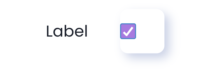
The self .chakra-checkbox selector targets the main CheckBox container, allowing customization of size, cursor behavior, and shadow effects.
/* Main CheckBox container styling */
self .chakra-checkbox{
  width: 2.8rem;
  height: 2.8rem;
  cursor: pointer;
  border-radius: .5rem;
  box-shadow: .3rem .3rem .6rem #c8d0e7, -.2rem -.2rem .5rem #FFFFFF;
}
Example 2 - Check Mark Control Style
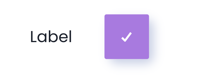
The self .chakra-checkbox span selector applies to the visual representation of the check mark control, adjusting its font size, weight, and transition effects.
/* Check mark control styling */
self .chakra-checkbox span{
  font-size: 80%;
  font-weight: 700;
  color: #9baacf;
  transition: .3s ease;
  border: 0;
  width: 100%;
  height: 100%;
}
Example 3 - Checked State Style
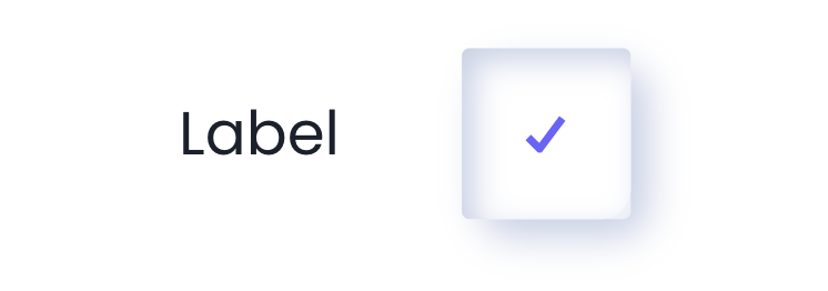
The self .chakra-checkbox span[data-checked] selector applies styles when the CheckBox is checked, changing the background, shadow, and color.
/* Checked state styling */
self .chakra-checkbox span[data-checked]{
  background: transparent;
  box-shadow: inset .2rem .2rem .5rem #c8d0e7, inset -.2rem -.2rem .5rem #FFFFFF !important;
  color: #6d5dfc;
}
Example 4 - Hover Effect on Checked State
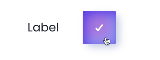
The self .chakra-checkbox span[data-checked]:hover selector applies styles when the checked CheckBox is hovered, creating a visual highlight effect.
/* Checked state styling */
self .chakra-checkbox span[data-checked]:hover{
  color: white;
  background-color: #6d5dfc;
  box-shadow: inset .2rem .2rem 1rem #5b0eeb, inset -.2rem -.2rem 1rem #8abdff !important;
}
Triggers and Events
Checkbox Component
The Checkbox component can respond to various events, enabling dynamic user experiences. Events that can trigger actions within the component include:
| Event | Description |
|---|---|
| On Click | Calls for an action when the user clicks on the component. |
| On Blur | Calls for an action when the component loses focus (user clicks outside). |
| On Focus | Calls for an action when the component gains focus (user clicks on it). |
| On MouseEnter | Calls for an action when the user's mouse cursor enters the area of the component. |
| On MouseLeave | Calls for an action when the user's mouse cursor exits the area of the component. |
Embedded Label
The embedded Label can also respond to various events, allowing for dynamic user experiences. Events that can trigger actions within the embedded icon include:
| Event | Description |
|---|---|
| On Click | Calls for an action when the user clicks on the Label. |
| On Keyup | Calls for an action when a keyboard key is released while the Label is in focus |
| On KeyDown | Calls for an action when a keyboard key is pressed down while the Label is in focus. |
| On MouseEnter | Calls for an action when the user's mouse cursor enters the area of the Label. |
| On MouseLeave | Calls for an action when the user's mouse cursor exits the area of the Label. |