Page Loader
The Page Loader component is a versatile UI element designed to integrate one Page into another within the context of your application.
Use Cases
The Page Loader component offers a multitude of applications, enhancing the modularity and interactivity of your Pages:
-
Nested Pages: Nest one Page within another to facilitate complex UI structures and content hierarchies.
-
Dynamic Content: Utilize the Page Loader to display dynamic content that can be updated on-the-fly through data binding
-
Conditional Loading: Implement conditional loading of Pages based on user interactions or specific conditions.
Properties Customization
The Page Loader component functions by displaying a designated Page within the current Page. The Page to be displayed is determined based on the initial value set for the Page Loader component. This initial value can be configured using either of the following methods:

- Direct Configuration: Utilize the Properties panel of the Page Loader to directly choose the target Page from a dropdown list.

- Dynamic Binding: Establish a binding with a qodlysource of type Text. By binding the component to this qodlysource and assigning it an initial value, you gain the flexibility to dynamically update the contents of the Page Loader. The initial value should correspond to the name of the target Page you intend to display.

Note that:
In the case of concurrent application of both methods, the content sourced from the bound qodlysource takes priority.
Navigating with Page Loader
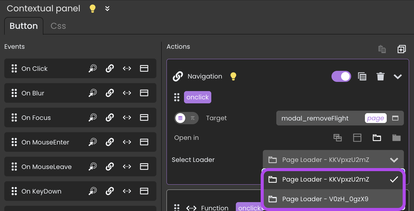
When orchestrating navigation actions through the Page Loader component, it's crucial to employ the Ref property to specify the components requiring processing during the navigation event. This property guarantees that the target Page is loaded, and its contents are integrated into the current Page.

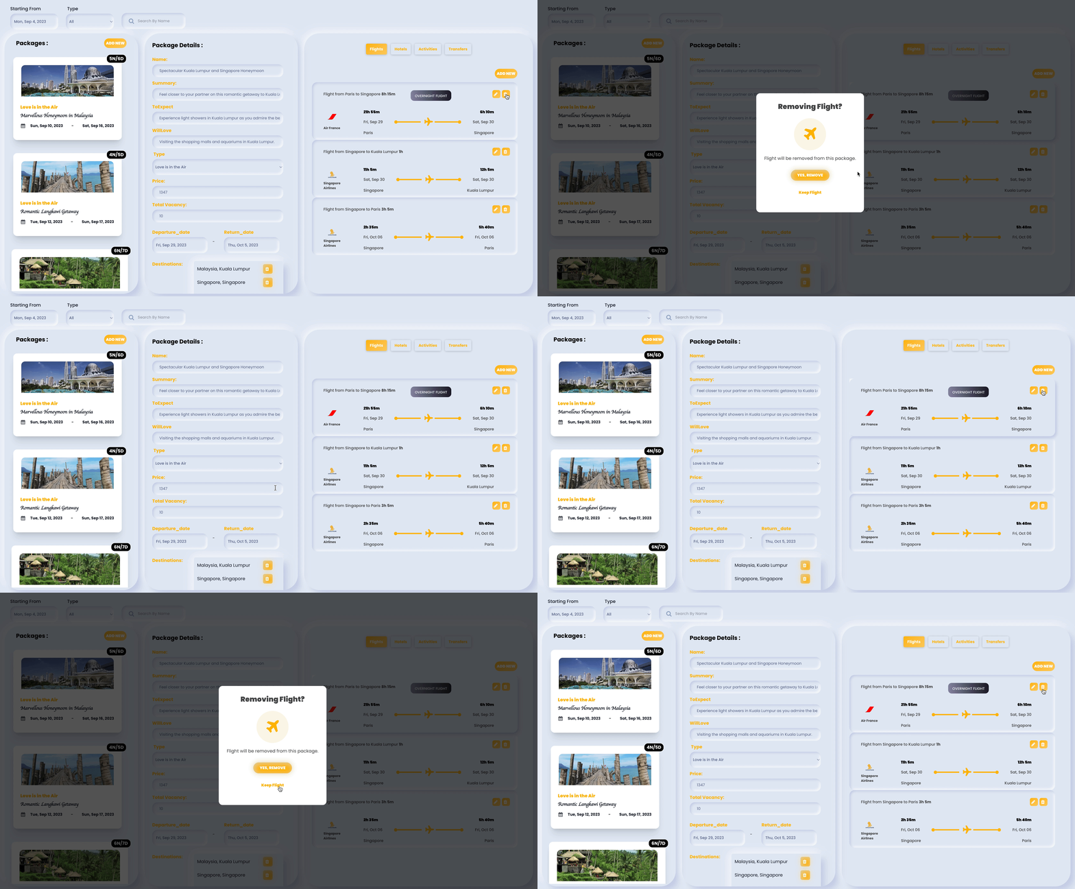
Consider a travel agency's backoffice solution, where a content manager needs to manage various aspects of travel packages. For instance, when the content manager attempts to delete a specific flight associated with a package, clicking on the delete button can trigger a navigation action. This action could lead to the loading of the Page modal_removeFlight using the Page Loader component with the reference 0FW_eM-2g1.

Triggers and Events
The Page Loader component can respond to various events, enabling dynamic user experiences. Events that can trigger actions within the component include:
| Event | Description |
|---|---|
| On Click | Calls for an action when the user clicks on the component. |
| On DblClick | Calls for an action when the user double-clicks on the component. |
| On MouseEnter | Calls for an action when the user's mouse cursor enters the area of the component. |
| On MouseLeave | Calls for an action when the user's mouse cursor exits the area of the component. |