Style Box
The Stylebox component serves as a versatile container designed to enhance content alignment and legibility within Pages. By adhering to precise position rules and flexbox layout, Styleboxes ensure that enclosed elements are well-organized and visually harmonious.
Enhancing Content Presentation
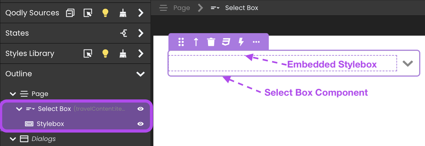
Styleboxes play a crucial role in optimizing content presentation and alignment, especially when integrated with specific components such as Tabs, Matrix, and Select Box. These components inherently incorporate Styleboxes to achieve uniformity and readability in their layouts.
- Tabs: Styleboxes within Tabs components facilitate consistent alignment of content across different tab panels.

- Matrix: When used in Matrix components, Styleboxes maintain alignment within individual cells.

- Select Box: Integrating Styleboxes with Select Box components aids in organizing dropdown menus.

Data Integration
When you drag and drop a Qodly Source attribute to a Stylebox, the following automatic creations occur:
- Entity Attribute: Generates a Text component or an Image component linked to entity.attribute based on its type.

- Length of a Selection: Establishes a Text component reflecting selection.length.

Triggers and Events
The Stylebox component can respond to various events, enabling dynamic user experiences. Events that can trigger actions within the component include:
| Event | Description |
|---|---|
| On Click | Calls for an action when the user clicks on the component. |
| On DblClick | Calls for an action when the user double-clicks on the component. |
| On MouseEnter | Calls for an action when the user's mouse cursor enters the area of the component. |
| On MouseLeave | Calls for an action when the user's mouse cursor exits the area of the component. |