Text
The Text component is a UI element designed to display text content on Pages.
Use Cases
The Text component is capable of fulfilling various text display needs:
-
Static Text: Use it to display unchanging content such as instructions, labels, and consistent information.
-
Dynamic Content: The Text component is not limited to static text. It can display dynamic content pulled from your Qodly Sources. This dynamic feature allows you to show text that adapts and updates based on data values.
Properties Customization
Enhance the Text component to align with your application's requirements using the following customization options:
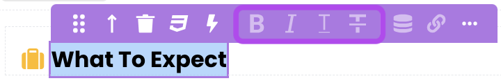
- Style Buttons: Apply various text styles such as Bold, Italic, Underline, and Strikethrough to the selected portion of text.
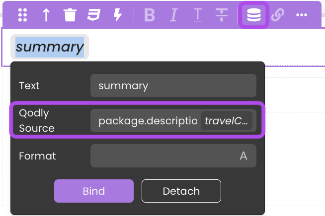
- Toggle Qodly Source: Bind the Text component's content to a qodlysource, making the text content dynamic and data-driven. By inserting a placeholder in the text on the canvas and specifying the qodlysource path (using keywords like
package.descriptionor$Thisin iterative components), you can dynamically populate the text content.
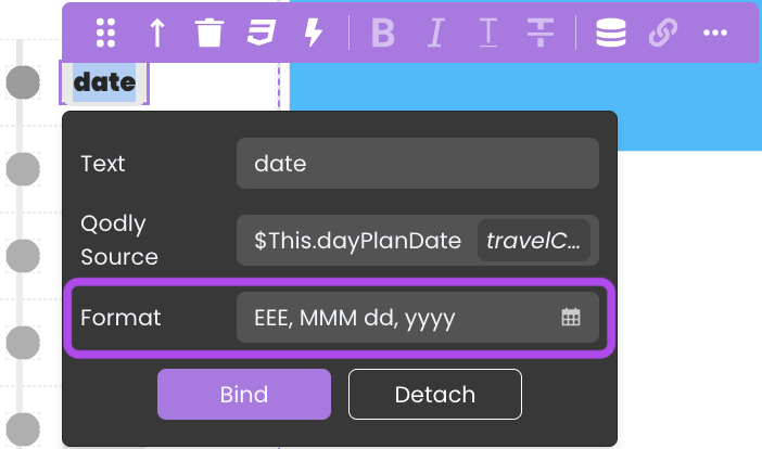
- Format Support: Depending on the chosen qodlysource, the Text component may offer format options to ensure the displayed data is presented in the desired manner like date formats. See Formats for a description of available formats.
- Toggle Link: Insert hyperlinks within the text content, binding them to specific text labels. You can choose whether the link opens in the same browser tab or a new tab. The link itself can be either a static URL or a dynamic value derived from qodlysources.
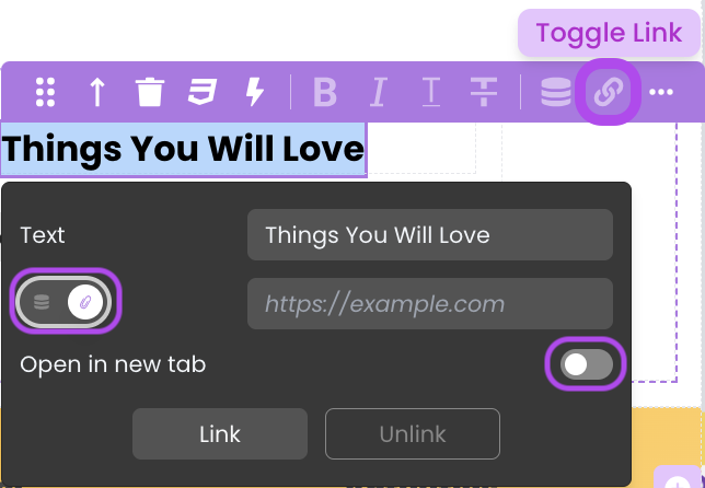
When the hyperlink directs to a file path within the Shared folder, it doesn't open in a new tab; instead, the browser triggers a download.
This follows the same concept as Navigate to Shared Folder Content through the External Link option.
Important: The customization provided by the Properties panel is not sufficient when the Text component contains multiple text nodes (datasources). In such cases, you must assign a dedicated CSS class to enforce a display: flex layout. This approach ensures that the component correctly arranges its text nodes. For a detailed list of the available classes and instructions on how to implement them, please refer to the Customizing Text Styles section.
Customizing Text Display Styles
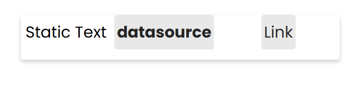
When dragging multiple text nodes into a single Text component, the display: flex setting cannot be fully customized via the properties panel. To fully customize properties such as direction, gap, justification, alignment, wrapping, or content, certain CSS classes are mandatory. The table below lists the CSS class names that must be used to correctly apply the flex display to the text.
Display Flex Class Names
| Class Name | Applies To | Description |
|---|---|---|
.q-row | The entire paragraph | Styles the entire paragraph area. |
.q-text | Applies on all text nodes | Targets all the text nodes including the static text, datasource and link. |
.q-datasource | Targets the datasource nodes | Applies styles on the datasource nodes. |
.q-whitespace | The empty spaces | Applies styles to the empty spaces inside the text component. |
Examples of Display Flex Class Names
The example below demonstrates how to implement a display-flex layout on the text component. The .q-row class sets up a flexible row layout with specific direction, gap, justification, alignment, wrapping, and content distribution. Additionally, the .q-text, .q-datasource, and .q-whitespace classes adjust typography, padding, and inter-element spacing without altering the default color settings.
self {
    display: block;
    width: 50%;
    margin: 0 auto;
    color: silver;
    box-shadow: 0 4px 8px rgba(0, 0, 0, 0.2);
    border-radius: 5px;
}

self .q-row {
    display: flex;
    flex-direction: row;
    gap: 1rem;
    justify-content: center;
    align-items: center;
    flex-wrap: wrap;
    align-content: center;
}

self .q-text {
    font-size: 2rem;
    line-height: 2;
}

self .q-datasource {
    padding: 1rem;
    border-radius: 4px;
    font-weight: bold;
}

self .q-whitespace {
    display: inline-block;
    width: 4rem;
}
Data Integration
The Text component is not limited to static text, it is also data-bound, which means it depends on a qodlysource to populate its options.
Data Binding
The Text component's content can be dynamically bound to Qodly Sources through the properties customization using the Toggle Qodly Source option.
Alternatively, you can establish the connection by dragging and dropping a qodlysource of type text, number, date, or duration onto the Page, resulting in the automatic addition of a Text component with the qodlysource bound to it.
Triggers and Events
The Text component can respond to various events, enabling dynamic user experiences. Events that can trigger actions within the component include:
| Event | Description |
|---|---|
| On Click | Calls for an action when the user clicks on the component. |
| On DblClick | Calls for an action when the user double-clicks on the component. |
| On MouseEnter | Calls for an action when the user's mouse cursor enters the area of the component. |
| On MouseLeave | Calls for an action when the user's mouse cursor exits the area of the component. |