Templates
Templates serve as a dynamic resource, offering pre-designed structures to kickstart your Page building process. These templates are carefully crafted to cater to various design needs, from minimalist landing pages to intricate multi-page forms.
These templates come ready-made, though they may require some customization to perfectly align with your project's unique needs.
The current list of available templates is not exhaustive and will continue to expand as Qodly Studio evolves.
Explore Templates
Navigate to the Components section and locate the Templates tab to explore the available options:
- Navigate to the Components Section: Find the Templates tab within the Components section.
- Select a Category: Once in the Templates tab, browse through the available categories. Choose the category that aligns with your project's requirements. For example, you might opt for the
Team managementcategory.
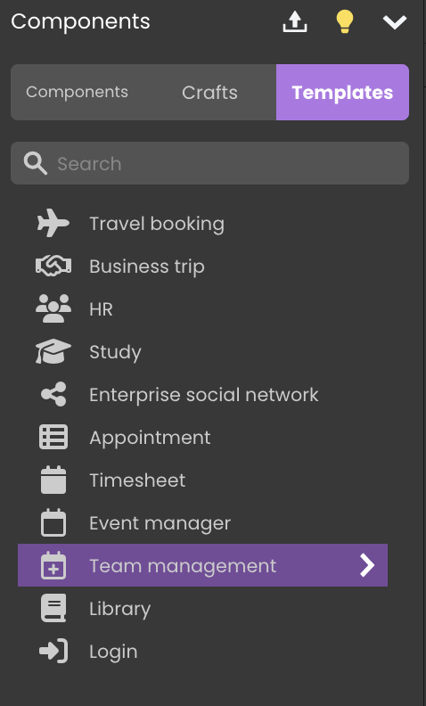
Quickly find categories by name using the search box .
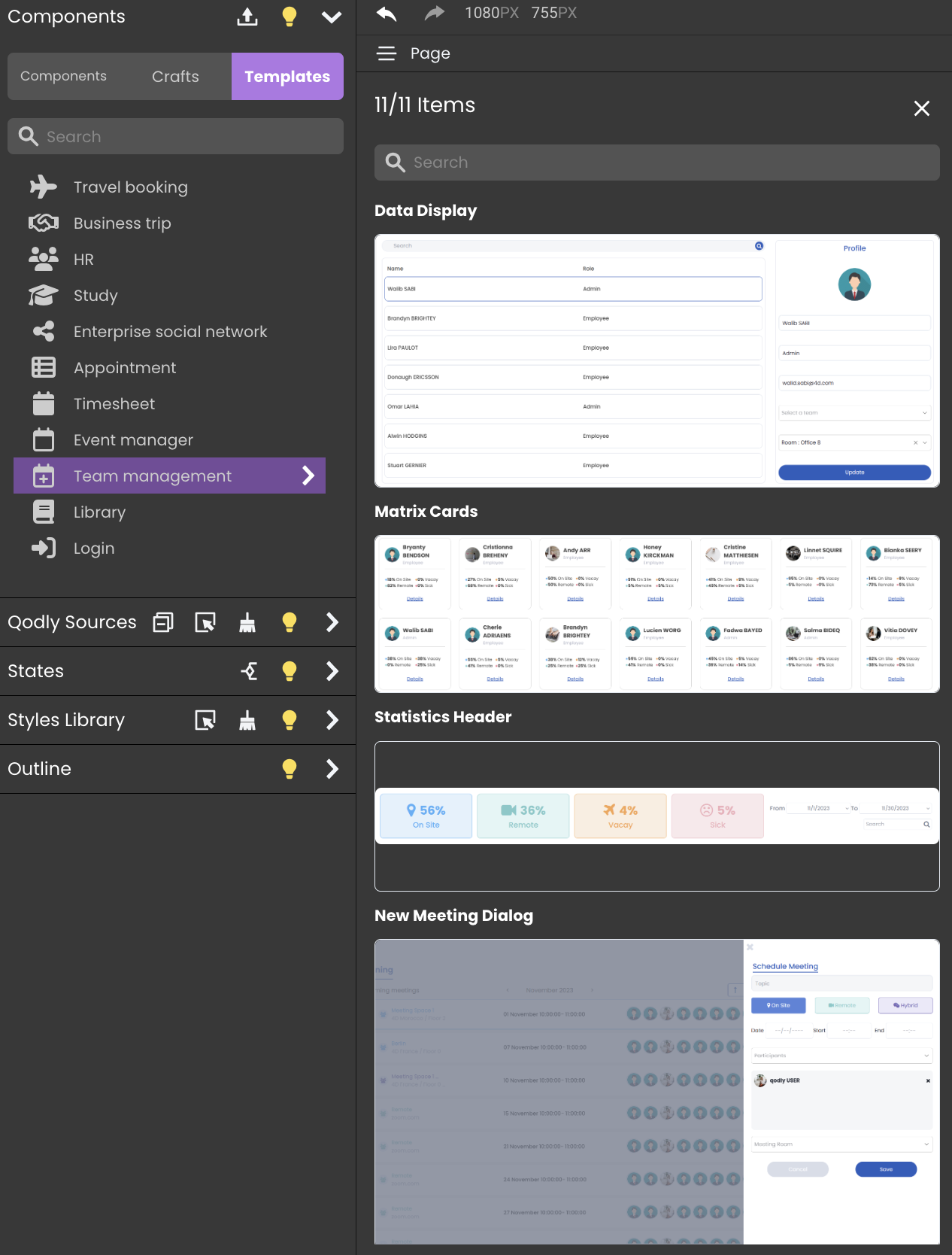
Explore Templates: Upon selection, a panel opens, presenting various templates.
Each template is accompanied by a
Preview Imageto visualize the template's content and aTitle and Descriptionto understand the template's purpose and functionality.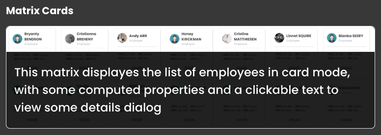
Using Templates
To use a template from the selected category, for instance, the datatable category , follow these steps:
- Select a Category: Click on the desired category (e.g., Datatables, Travel, or Business). This will open a panel displaying all the templates available within that category.
- Choose a Template: Browse the templates shown in the panel. Each template includes a preview image and a brief description.
- Drag the Template (Not the Category!): Click and drag a specific template from the panel directly onto the canvas.
Customizing Templates
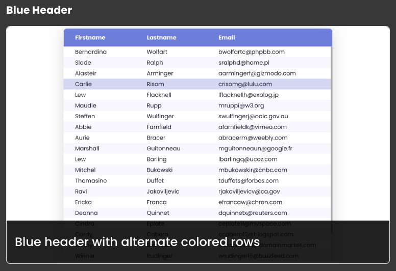
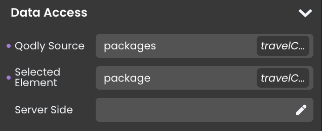
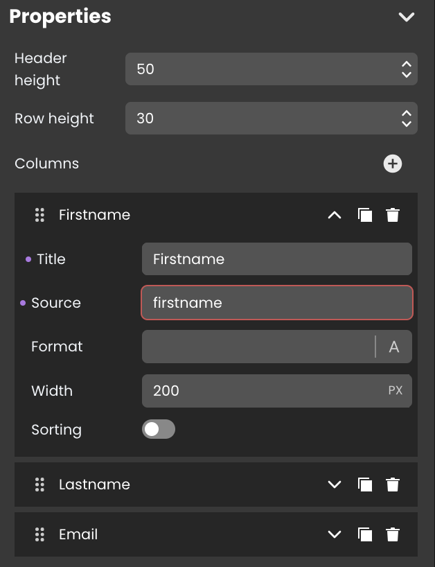
While templates provide a solid starting point, customization is essential for aligning your design with your unique vision and project requirements. Even in seemingly ready-to-use templates, like the datatable with the blue header, specific configurations may need adjustment. Here are key elements to customize:
- Qodly Source: Identify and set the appropriate qodlysource for the component.
- Properties Customization: Customize component properties, such as the column source, to accurately represent the data you want to showcase.
- Css class: Tailor the CSS class code to match your desired styling preferences.
