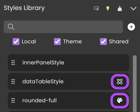
Styles Library
After placing a component on the Canvas, you have the freedom to tailor its appearance using a variety of styling tools.
Overview
The Styles Library provides a powerful way to style your components. You can do this by simply dragging CSS classes from the Styles Library and dropping them onto the components.
The Styles Library provides three distinct types of CSS classes:
- Local: These CSS classes are specific to the Webforms in which they are created and do not have an icon next to them.
- Theme: Predefined CSS classes designed for standard themes, which can be applied across all Webforms in your application. You can recognize them by this icon
 .
. - Shared: CSS classes that are shareable and can be used across all Webforms within your application. These are identifiable by this unique icon
 .
.
Managing CSS Classes
Adding a CSS Class
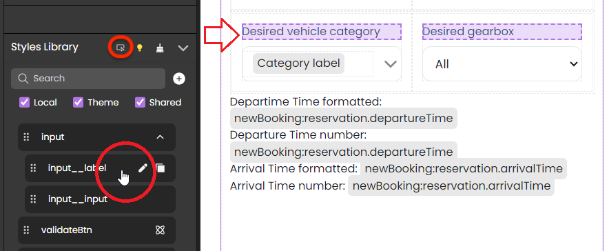
To add a CSS class, click the  button, give it a name, and then choose the appropriate type:
- For a local CSS class: Leave the "Create as Shared" option unchecked.
- For a shared CSS class: Check the "Create as Shared" option.
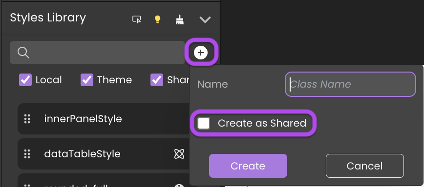
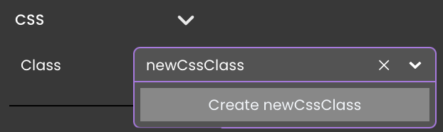
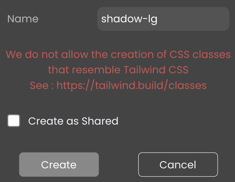
If this name doesn't correspond to any existing CSS classes, you will be prompted with the option to create a new one.
Editing a CSS Class
 within the Styles Library next to the class's name. This action will open it in the contextual panel.
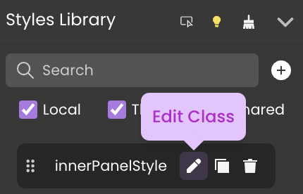
Both Local and Shared CSS class codes can be modified in the Contextual panel at the interface's bottom.
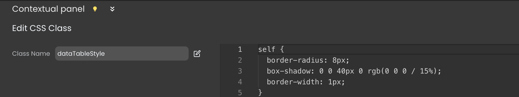
The changes will affect all the components utilizing this CSS class.
- Theme classes, however, are non-editable, they can only be viewed by clicking on the
 button next to their name in the Styles Library.
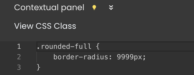
 .
.
Renaming a CSS Class
Inside the Contextual panel, you'll find a field with the class name  and an edit button
  next to it. Click on it to rename the class.
Theme CSS classes cannot be renamed.
Deleting a CSS Class
To remove a CSS class, click the delete button  next to its name in the Styles Library.
Theme CSS classes cannot be deleted.
Removing Unused CSS Classes
An unused CSS class refers to any local class that is defined but not utilized in any section of the webform.
Click on the Delete Unused Elements button 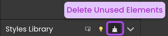 located in the Styles Library's header to cleanse your webform of unnecessary CSS classes.
Converting a Local CSS Class to Shared
Inside the Contextual panel, you'll find a field with the class name  and a share button
  next to it. Click on it to transform a local CSS class into a shared one.
Tracking CSS Classes Usage
Working with CSS
Using CSS Classes
After selecting a component, you can adjust its properties using the properties panel. This involves style properties, and there is a clear distinction between component properties and styling.
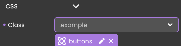
Associating a CSS class with a component can be accomplished in two ways:
Drag and drop a CSS class onto your component from the
Styles Library.Using the Properties panel, link a CSS class to the component through the
CSSsection under theStylecategory. This can be done either by
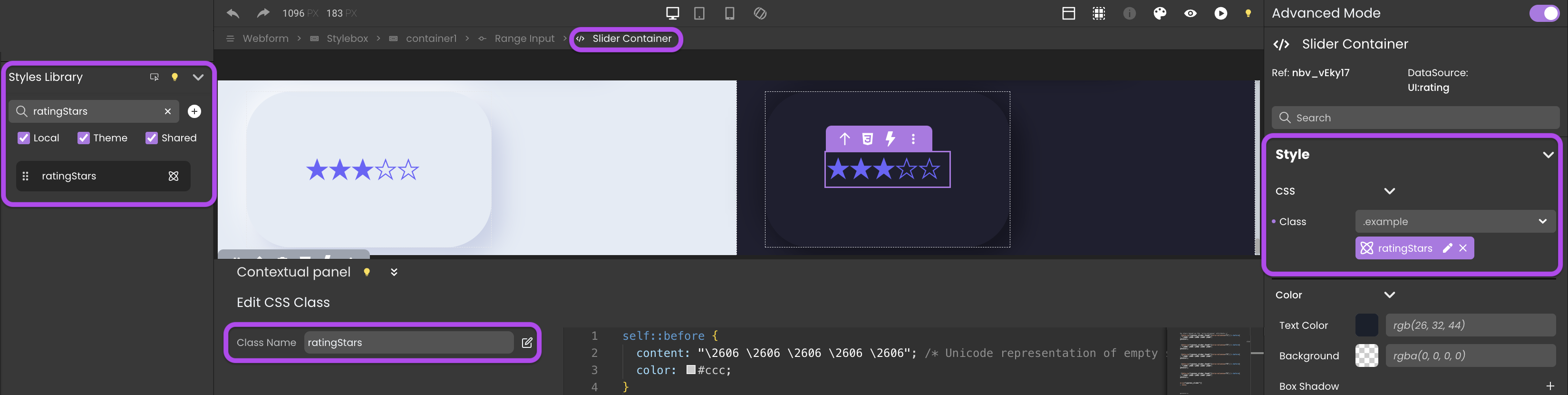
The provided example demonstrates applying a CSS class named ratingStars to the embedded element Slider Container of the Range Input component. This modification transforms the standard slider into a star rating slider, suitable for rating activities or services. The corresponding code for this CSS class is shown below:
self::before {
  content: "\2606 \2606 \2606 \2606 \2606"; /* Unicode representation of empty star */
  color: #ccc;
}
/* Fill the stars based on the 'aria-valuenow' attribute */
self:has( [data-cy="cypress_slider_thumb"][aria-valuenow="1"] )::before{
  content: "\2605 \2606 \2606 \2606 \2606";
  color: #6d5dfc;
}

self:has( [data-cy="cypress_slider_thumb"][aria-valuenow="2"] )::before{
  content: "\2605 \2605 \2606 \2606 \2606";
  color: #6d5dfc;
}

self:has( [data-cy="cypress_slider_thumb"][aria-valuenow="3"] )::before{
  content: "\2605 \2605 \2605 \2606 \2606";
  color: #6d5dfc;
}

self:has( [data-cy="cypress_slider_thumb"][aria-valuenow="4"] )::before{
  content: "\2605 \2605 \2605 \2605 \2606";
  color: #6d5dfc;
}

self:has( [data-cy="cypress_slider_thumb"][aria-valuenow="5"] )::before{
  content: "\2605 \2605 \2605 \2605 \2605";
  color: #6d5dfc;
}

self [data-cy="cypress_slider"]{
    position: absolute !important;
    width: inherit;
    opacity: 0;
}
The size of the stars is determined by the value specified in the Font category.
Exporting Styles as CSS Class
To reuse the style of a component, you can export it as a CSS class by following these steps:
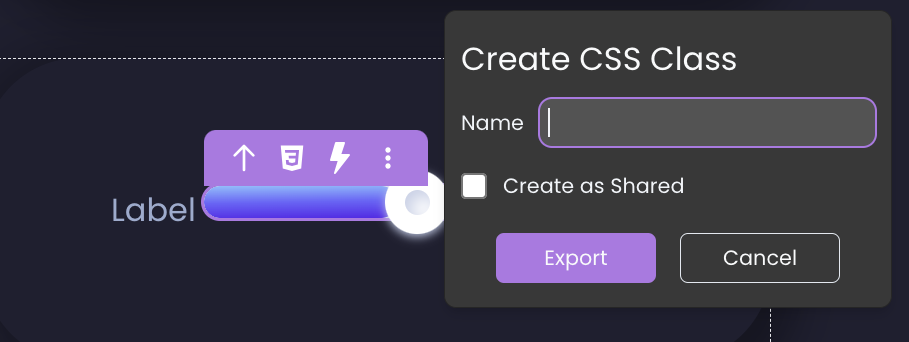
- Select a component on the canvas, triggering the appearance of the tooltip.
- Click the CSS icon
 within the tooltip and provide a name for the new CSS class.
 - If you wish to export a shared CSS class, enable the
Create as Sharedoption. - Click the
Exportbutton.
This process exports only styles defined in the properties panel and not those from any other assigned CSS class.
Exporting styles instantly assigns the new CSS class to the component, removing the styles from the properties panel that are now defined in the assigned CSS class.
CSS Class Naming Priority
When assigning both a shared and a local CSS class with the same name:
The component is assigned both the local and shared CSS classes, regardless of the selection.
However, the shared CSS class takes precedence, and its styles are prioritized over those of the local class.
Consequently, if styles in the local CSS class are defined but not present in the shared class, they are still applied to the component.
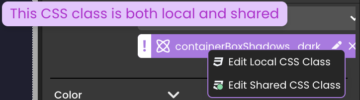
Qodly Studio permits the use of the same name for both a local and shared CSS class.
Overriding Style Properties
A priority-based scenario determines which styles take precedence over others:
When assigning the theme CSS class
bg-red-500to a component, thebackgroundproperty displaysrgb(239,68,68).Subsequently assigning a local CSS class to the same component, featuring a different background color, will override the initial value set by the theme CSS class.
A shared CSS class takes precedence, prioritizing its styles over those of the local class, thereby overriding the initial value set by the local CSS class.
Modifying this value with another background color from the properties panel will lead to the theme, local and shared CSS classes being overridden.
Customizing DataTable Styles
The DataTable component styles can be customized by leveraging specific CSS classes that target various elements of the table:
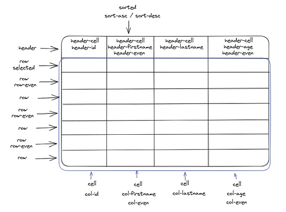
CSS Table Classes
The following specific CSS classes are supported:
| Area | Class name | Applies to |
|---|---|---|
| Header | .header | The entire header |
| .header-cell | All cells in the header | |
| .header-even | Header of even columns | |
| .header-datasourceName (*) | The header of the corresponding datasource | |
| Row | .row | All rows |
| .selected | The selected row | |
| .row-even | All even rows | |
| .hover | The hovered row | |
| Cell | .cell | All cells |
| Column | .col-datasourceName (*) | The column of the corresponding datasource |
| .col-even | Even columns | |
| .sorted | Sorted colums | |
| .sorted-asc | Ascending sorted columns | |
| .sorted-desc | Descending sorted columns |
(*) Example: .header-lastname, .header-employer-name (use a - instead of . for relations)
Examples
The following CSS definitions enable the design of custom DataTable components.
Example 1 - Blue Headers
self {
  border-radius: 10px;
  box-shadow: 0 0 40px 0 rgb(0 0 0 / 15%);
}

self .header .header-cell {
  background-color: #6c7ae0;
  color: #fff;
  font-weight: bold;
  padding: 1.25rem 2rem;
}

self .row {
  align-items: center;
}

self .row .cell {
  padding: 0.5rem 2rem;
}

self .row .cell > span {
  justify-content: flex-start;
}

self .row.selected {
  background-color: #d2d7f5;
}

self .row-even:not(.selected):not(:hover) {
  background-color: #f8f6ff;
}

self .header .resizable > :not([hidden]) ~ :not([hidden]),
self .row > :not([hidden]) ~ :not([hidden]),
self .Grid .innerScrollContainer,
self .Grid .innerScrollContainer > :not([hidden]) ~ :not([hidden]) {
  border-width: 0;
}
Example 2 - Green Headers
self .header .header-cell {
  background-color: #324960;
  color: #fff;
  font-weight: bold;
  font-size: 14px;
  display: flex;
  align-items: center;
  justify-content: center;
}

self .header .header-even {
  background-color: #4fc3a1;
}

self .row {
  align-items: center;
}

self .row .cell {
  font-size: 14px;
  text-align: center;
}

self .row .cell > span {
  justify-content: center;
}

self .row.selected {
  background-color: #caede2;
}

self .row-even:not(.selected):not(:hover) {
  background-color: #f8f8f8;
}

self .header .resizable > :not([hidden]) ~ :not([hidden]),
self .row > :not([hidden]) ~ :not([hidden]),
self .Grid .innerScrollContainer,
self .Grid .innerScrollContainer > :not([hidden]) ~ :not([hidden]) {
  border-width: 0;
}
Example 3 - Dark Mode DataTable
This example assumes that the DataTable contains a column associated with a lastname datasource.
self {
 background-color: rgb(61, 54, 61);
}

self .row {
  align-items: center;
}

self .header {
 font-weight: bold;
}

self .header .header-cell {
 background-color: transparent;
 border-top: none;
 border-bottom: none !important;
 color: #fff;
 font-size: 11px;
 text-transform: uppercase;
 letter-spacing: .2rem;
}

self .row {
 background-color: rgba(0, 0, 0, 0.1);
 color: #777;
 transition: 0.3s all ease;
}

self .row:hover {
 background-color: rgba(0, 0, 0, 0.1);
 color: white;
}

self .row:hover .col-lastname {
 color: #b474e4;
 font-weight: bold;
 font-size: 18px;
 text-transform: uppercase;
}

self .row.row-even {
 background-color: unset;
}

self .row .cell > span {
  justify-content: flex-start;
}

self .header,
self .header .resizable > :not([hidden]) ~ :not([hidden]),
self .row > :not([hidden]) ~ :not([hidden]),
self .Grid .innerScrollContainer,
self .Grid .innerScrollContainer > :not([hidden]) ~ :not([hidden]) {
  border-width: 0;
}
These style examples are the same as those applied to the DataTables found in the templates categorized under DataTables.
Progress Bar
Displaying the Progress Bar
The Progress Bar is triggered when the front end anticipates at least one REST request response. This visual element is crafted to signify active server-side processes, offering a clear indication, particularly during the execution of REST queries.
Tailoring the Progress Bar
Customizing the appearance of the progress bar is facilitated through the following methods:
Creating a shared CSS class named
qodly-progress:self {
background-color: blue;
height: 20px;
}Creating a custom named CSS class and targeting the div element with the class
qodly-progress:div.qodly-progress {
background-color: blue;
height: 20px;
}
CSS Cascading in Webform Loaders
When components like a button in a webform loader and another in the main webform share the same local CSS class name, unexpected style mergers can occur. This is a result of CSS cascading, where styles from the parent webform combine with those of nested elements, causing design inconsistencies.
<div class="fd-canvas fd-canvas--airy overflow-auto bg-white">
  <button class="fd-component fd-button localCssClass"></button>

  <div class="fd-stylebox fd-component relative p-2">
    <div class="fd-canvas bg-white">
      <button class="fd-component fd-button localCssClass"></button>
    </div>
  </div>
</div>
To prevent such issues, it's important to use unique class names, particularly in webforms with layered structures.
This issue is also prevalent in more complex webform arrangements, such as dialogs within webform loaders, where CSS cascading can lead to similarly unexpected styling challenges.
See also
If you're not familiar with CSS properties and styles, or you need a refresher, here are a few useful links and tools:
- Learn CSS on the MDN website
- A guide to flexbox properties on css-tricks.com
- Box-shadow examples, box-shadow generator