Events
Events serve as a mechanism for initiating specific actions, often employed to trigger particular behaviors. They collaborate with various actions to establish dynamic interactions within an application.
For instance, when a user interacts with a webpage by clicking a button, you have the flexibility to determine the response, whether it involves invoking a function or opening another webpage. Furthermore, events can be activated in response to updates in a Qodly Source.
Within Qodly Studio, events play a pivotal role in executing code on the Qodly web server, without requiring any supplementary JavaScript.
Types of Events
Events can be set to trigger either when end-users perform specific actions or when qodlysources are updated.
User events
You can configure events to activate in response to specific actions performed by end-users, such as clicking buttons, moving the mouse cursor, and more.
Typical user events include On Click, On DblClick, On MouseEnter, On Keyup, and others. The available events may vary depending on the selected component, and detailed documentation can be found in the Triggers and Events section on each component's page.
Qodly Source events
Besides events triggered by end-user actions, events can also be automated to respond when qodlysources undergo changes. The primary event for qodlysources is the On Change event.
When the On Change event is linked to a qodlysource, it will trigger in the following scenarios:
| Trigger | Description |
|---|---|
| Qodly Source | |
| Entity Qodly Source | The contents of the entity attribute change |
| Entity Selection Qodly Source | |
| Scalar Qodly Source | The contents of the scalar qodlysource change |
Using the reload action within an on-change event can create a circular dependency. This causes Qodly Studio to enter an infinite loop of reloading, which results in the application freezing.
When you set an on-change event to reload the qodly source, the following happens:
A change in the qodly source triggers the on-change event.
The on-change event contains a reload action.
The reload action causes the qodly source to reload, which is considered a change.
This change triggers the on-change event again.
This creates a loop:
Change → On-Change Event → Reload → Change → On-Change Event → Reload → ...
This loop continues indefinitely until Qodly Studio runs out of resources or crashes, leading to the application freezing.
Events Management
The Contextual panel facilitates the association of class functions, navigation actions, and standard actions with distinct events within your application.
Adding an Event
To bind class functions, navigation actions or standard actions with events, follow these steps:
Select a Component or Qodly Source: Begin by choosing the component or qodlysource to which you want to attach an event. This selection can be made using the canvas, the outline, or, in the case of Qodly sources, either the shared Qodly Sources area or the local Qodly Sources area.
Expand the Contextual Panel: Once your selection is made, expand the
Contextual panel . It will provide you with a list of compatible events specifically tailored to your chosen component or qodlysource.
Bind the Desired Action to the Event: Next, select the type of action
 you wish to bind to the event. You have three options:
- Standard Action: Configure automatic actions on qodlysources, such as create, save, drop, or order by, without the need for coding.
- Navigation Action: Set up actions related to navigation within the application, such as opening another page or redirecting to an external URL.
- Class Function: Use a custom function to handle the event.
- Dialog Action: Configure to trigger dialog-related events.
Action Bound to Event: In the list of available events, you will notice a purple bullet
 displayed on the left side of events that have already been configured (if any).
- Configure Event Properties: Complete the remaining steps specific to each action type, as detailed in the respective sections within the configuring events section.
You can define different actions for the same event.
Removing an Event
 located within the event box. This action will result in the removal of the event that is bound to an action.
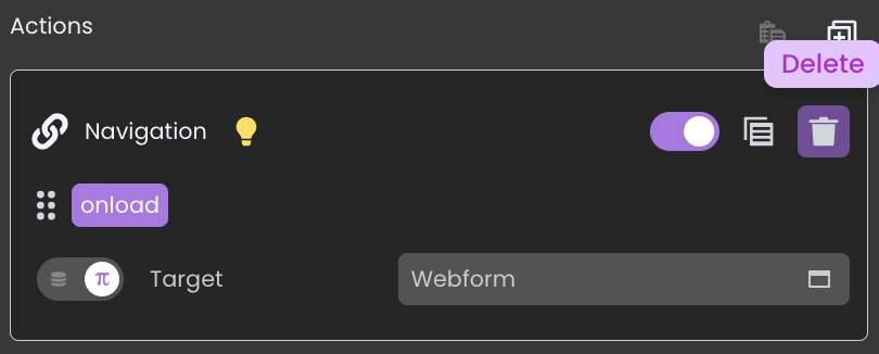
Copying an Event Action
To facilitate easier management of repetitive event actions across various parts of your application, follow these steps:
- Locate the Event Action: Navigate to the event action you intend to copy.
Copy the Event Action: Click the copy button
 associated with the event action. This copies the event action to your system clipboard.
Pasting an Event Action
Once an event action is copied, it can be pasted into another event. Here’s how:
Access the Target Event: Navigate to the component event panel where you wish to integrate the copied action.
Paste the Event Action: Click the paste button
 in the action section of the contextual panel.tip
If the paste button is inactive
 , it indicates that there is no event action currently copied to your clipboard.
Adjust Events: Adapt the pasted event action to fit the new context. Modify it as necessary to ensure compatibility with the target component or Qodly Source.
Event CompatibilityWhen pasting an event action, only those events that are compatible with the targeted component or Qodly Source will be retained. For example, if you copy an action designed for an
onClickevent from a button and paste it onto a Qodly Source that only supportsonChange, you will need to define appropriate events manually.
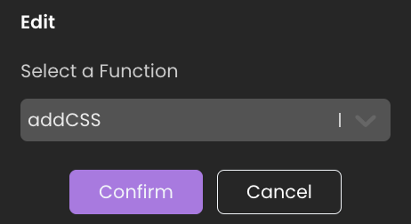
Modifying a Function Call
Customize your application by modifying the function calls within event actions without the need to recreate the action from scratch.
Select the Event Action: Identify and select the event action you need to modify.
- Edit the Function Call: To change the function, click the "Edit Function" button
 next to the function name. This will open a dialog where you can select a new function.
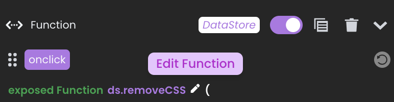
- Choose the Function: Use the typeahead dropdown to select the new function you wish to use. Options appear based on your input for easier selection.
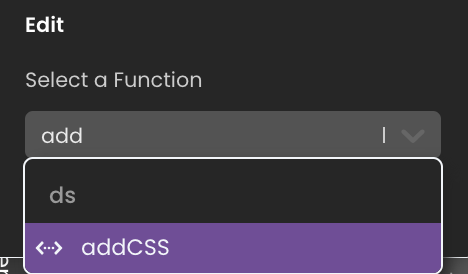
- Confirm the Changes: Once you select the new function, click "Confirm" to update the event action. The event action will maintain its parameters and return values as closely as possible to the original configuration.
Toggling Event Execution
 . This allows you to enable or disable the event as needed to meet your specific requirements.
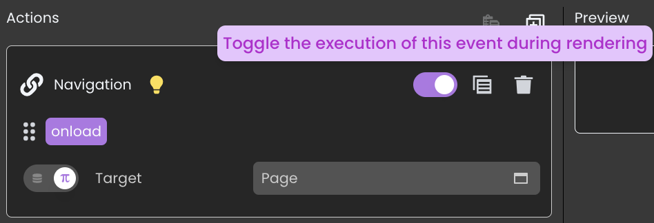
This feature is valuable for scenarios like debugging or temporarily pausing specific event executions without removing them from your application entirely.
Toggle Event Card Visibility
When the contextual panel is opened for a component or a qodlysource, all events are initially collapsed to provide a concise representation of their content. To expand all event cards, click the  button at the top right of the contextual panel, and to collapse them, click on the
  button.
 button in the upper right corner of the event card.
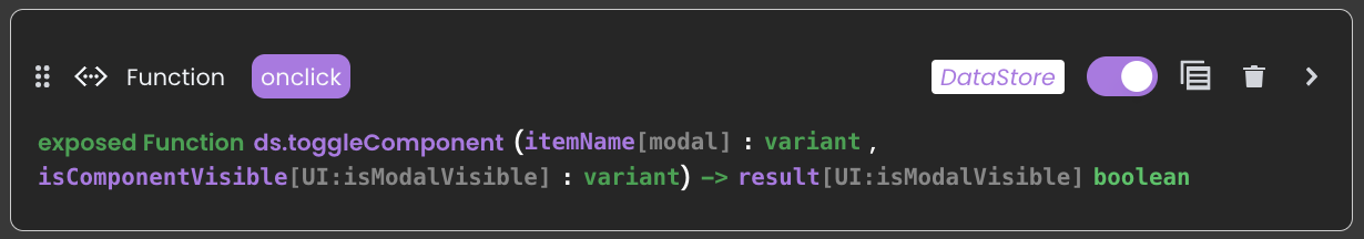
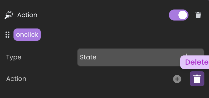
Standard Action
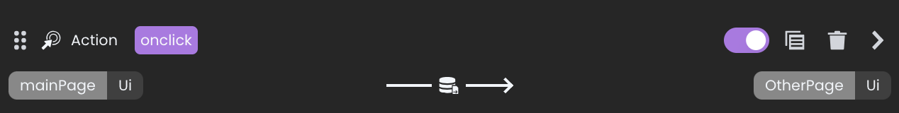
For events bound to Standard actions, the collapsed card displays the qodlysource name involved, followed by its namespace if it's shared or Page when local, on the left side. On the right side, the icon of the standard action is shown.
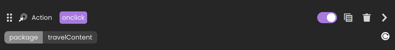
However, in specific cases, there may be minor differences in the display. For instance, in the case of the standard Copy action, the right side, instead of showing the icon of the standard action, displays the targeted qodlysource where the copying is intended.
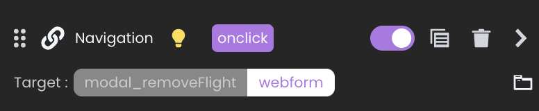
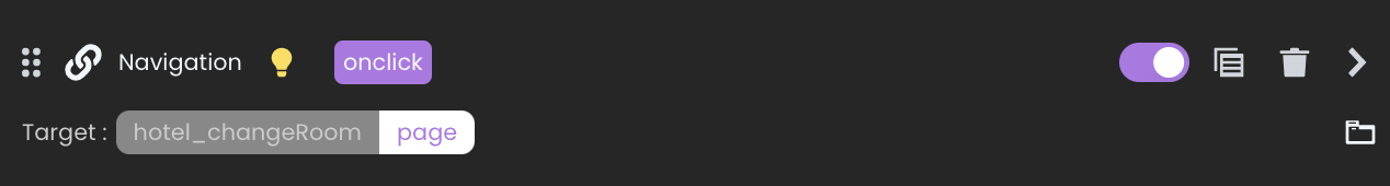
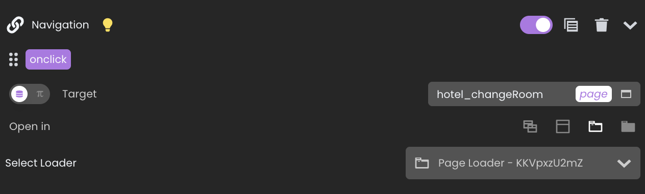
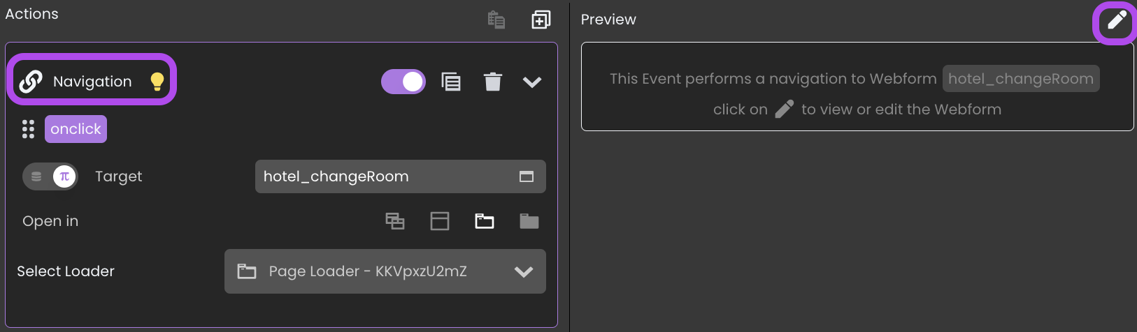
Navigation Action
For events bound to Navigation actions, the collapsed card displays only the targeted Page on the left side, with the icon of the transition method on the right side.
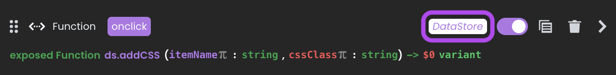
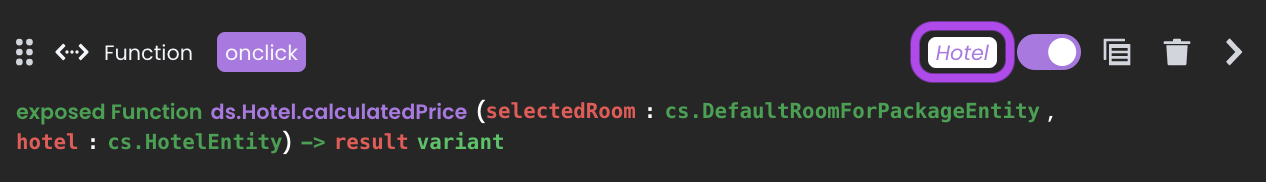
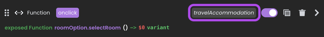
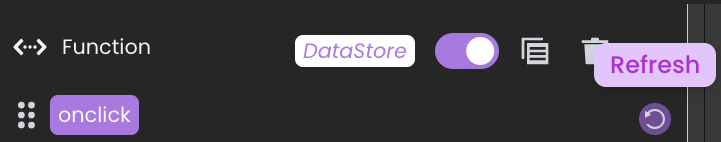
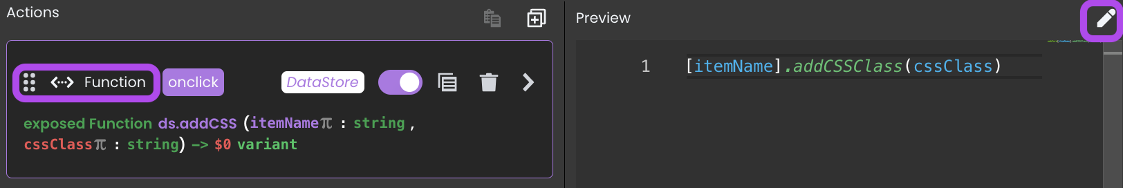
Class Functions
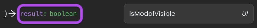
For events bound to Class functions, the collapsed card displays the function signature, including its name, parameters with filled values, and the returned result. The keyword displayed in the event card varies depending on the type:
- Exposed datastore class functions distinguishable by the keyword
Datastore.
- Exposed dataclass class functions distinguishable by the keyword
Dataclass Name.
- Exposed entity class functions and entity selection class functions, distinguished by the
Namespace Of Qodly Sourcekeyword, encompass shared functions when these entities serve as shared qodlysources.
- Exposed singleton class functions, distinguished by the
Pagekeyword.

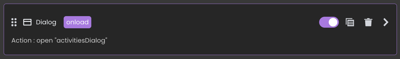
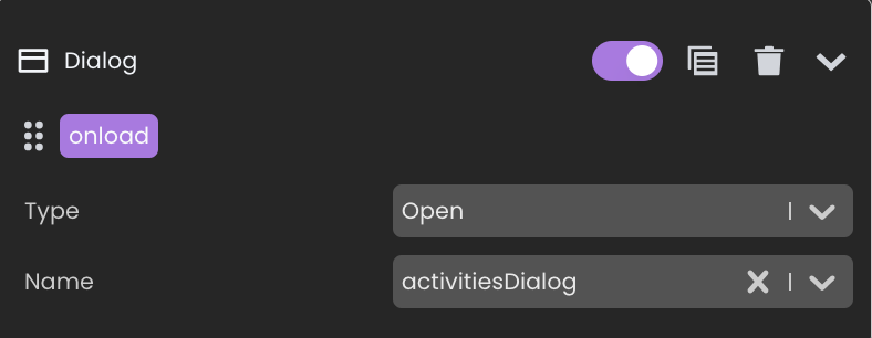
Dialog
For events bound to Dialogs, the collapsed card displays the action type name, followed by the dialog name involved.
Reload Event Function Prototype
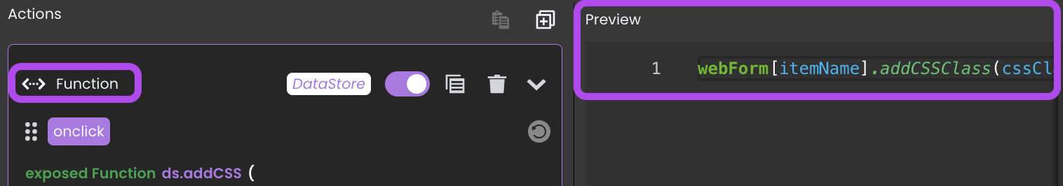
Chaining actions
In event coordination, actions are linked together sequentially. Pay attention to the alignment of each action with its predecessor, contributing to the overall flow and effectiveness of the process.
Preview Section
In the preview section, various capabilities are available when actions are bound to a specific event, depending on the type of action. It's worth mentioning that standard actions have no effect in this context.
- Preview Function Code: Selecting a function bound to a particular event allows you to preview its content within the preview section.
- Edit Function Code: To directly open and edit a function associated with a specific event, simply select the function and click on the function edit icon
 .
.
- Open Linked Page: When dealing with a navigation action bound to a specific event, selecting it allows you to access and open the Page associated with that event, using the same icon .
Binding Standard Actions to Events
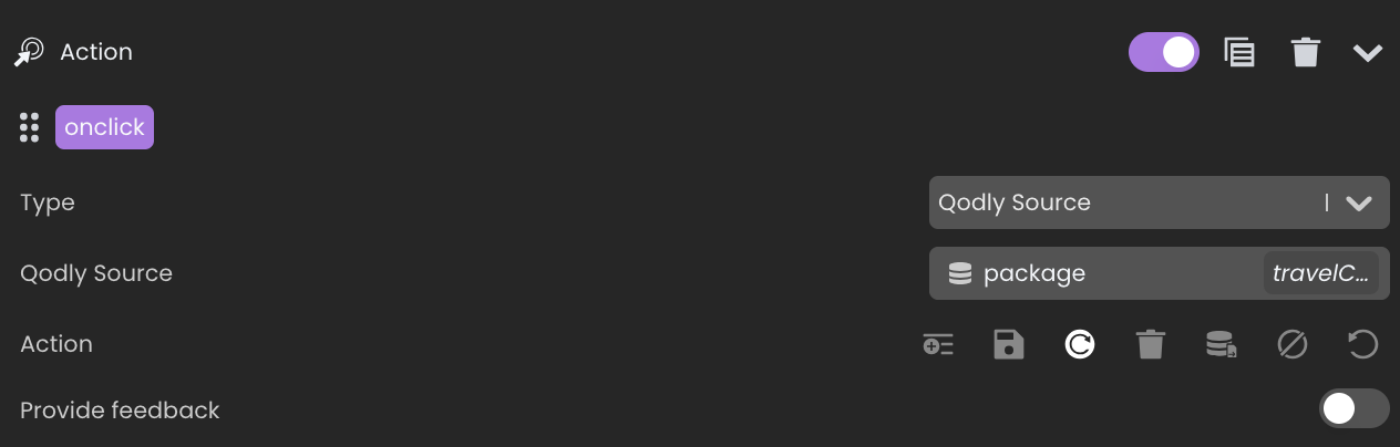
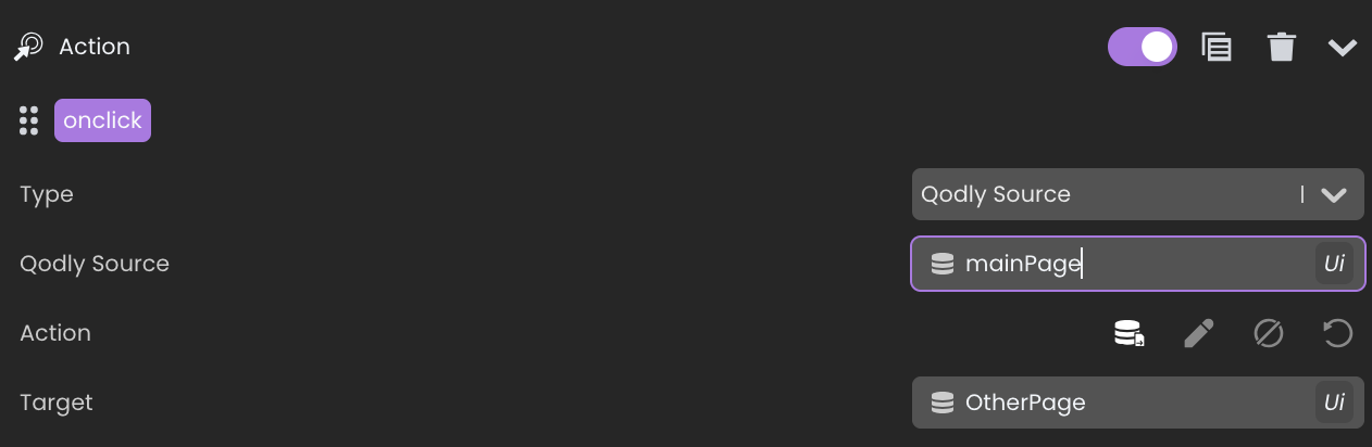
Standard actions are applicable to both Qodly Sources and States, with their availability and specific functionality depending on the type of qodlysource or state involved. Qodly Sources can be categorized into three types: Entity, Entity Selection, and Scalar. Additionally, actions within Page states play a crucial role in defining the page's behavior in response to user interactions, further enhancing the dynamic capabilities of the system.
Qodly Sources
After binding a standard action to a qodlysource with an event, follow these steps:
Define Action: Proceed to the Action section to unvail the available actions, which vary depending on the type of the qodlysource:
Qodly Source Type Action Icon Description Scalar Copy 
Copy the content of the qodlysource to a target qodlysource Set Value 
Update the qodlysource with a new value, which can be a String, Number, Boolean, Date, Array, or Object (with JSON validity). Note that this will trigger any configured OnChange event for the qodlysource. Clear 
Erase the content within the qodlysource Reset 
Resets the qodlysource to its initial value Entity Selection Order By 
Specify one or more attributes to sort and select direction Query 
The query is provided as a string and supports the same syntax as an ORDA query, except for formula ( eval) and thesettingsobject. Placeholders can be used with qodlysources or data as-isReload 
Reload the entire entity selection from the server All 
Load all entities of the same dataclass Clear Remove any content and create a new, empty selection of the same dataclass Reset Resets the entity selection qodlysource to its initial value (All or none) Copy Copy the entity selection to a target entity selection qodlysource Clean 
Clean the entity selection to ensure it references only existing entities, maintaining consistent length with the referenced entities Qodly Source Entity Create 
Generate a new entity in memory from the corresponding dataclass (see Note) Save 
Save the entity on the server Reload Reload entity values from the server Drop 
Delete the entity on the server Copy Copy the entity to a target entity qodlysource Clear Put nullin the qodlysource. If the qodlysource is the selected element of a component (Matrix, Select box, Datatable), clearing the qodlysource also unselects the selected elementReset Resets the entity qodlysource to its initial value (First or none) First 
Navigate to the first entity within the entity selection Previous 
Move to the previous entity within the entity selection Next 
Advance to the next entity within the entity selection Last 
Navigate to the last entity within the entity selection Entity (Standalone) Create Generate a new entity in memory from the corresponding dataclass (see Note) Save Save the entity on the server Reload Reload entity values from the server Drop Delete the entity on the server Copy Copy the entity to a target entity qodlysource Clear Put nullin the qodlysource. If the qodlysource is the selected element of a component (Matrix, Select box, Datatable), clearing the qodlysource also unselects the selected elementReset Resets the qodlysource to its initial value
Entities originating from an Entity Selection Qodly Source enable iterative navigation within the selection, while Independently Created Standalone Entities are generated independently and lack any selection affiliation.
Keep in mind that the Create action only creates a new, blank entity in memory. If you want to save this entity in the datastore, you need to execute the Save action. New entity attributes are filled with null values. If you want to create, initialize, and save a new entity, you might consider using a QodlyScript function.
Provide Feedback: Enable the
Provide Feedbackcheckbox to customize the handling of unexpected error messages, determining what will be displayed to end users. For more detailed information, refer to the Provide Feedback section. Here, you have the ability to:- Provide simple UI feedback on a
Save,Reload, orDropstandard action on an entity. - Provide simple UI feedback on a
Reload,Order by, orQuerystandard action on an EntitySelection.
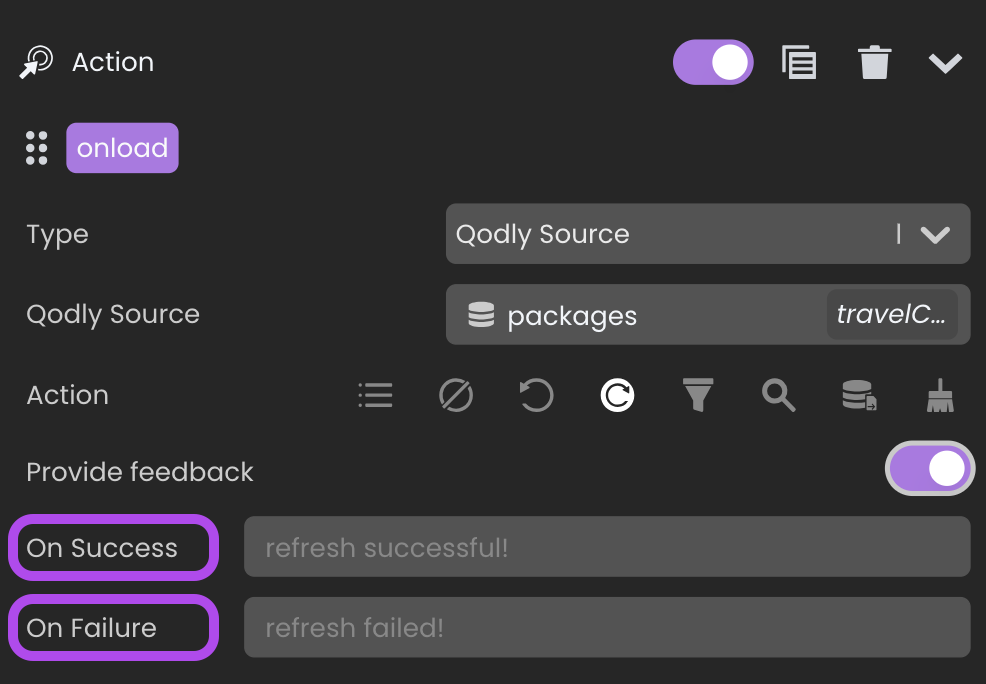
- Provide simple UI feedback on a
States
Upon binding a standard action to a state, follow these steps:
- Define Action: Proceed to the Action section to unvail the available actions, which vary depending on the type of the qodlysource:
- Add Action: Utilized for incorporating modifications from selected states into the base state.
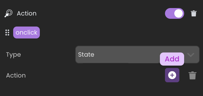
- Delete Action: This action facilitates the removal of selected states, along with their changes, in relation to the base state.
When a new state is applied or removed as a user interacts with an input field, the interaction remains uninterrupted ensuring that the focus on the input field is not lost by the state change.
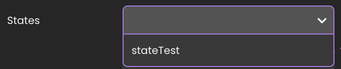
The Base state and Conditional states, however, are not included among these selectable options. Only Non-Conditional states are included.
The states are enabled in the given order of the standard action (same if WebForm.enableState is called several times with different states).
If a state is initially "Non-Conditional" but later transitions to a "Conditional" state, any standard actions previously applied to this state will be removed.
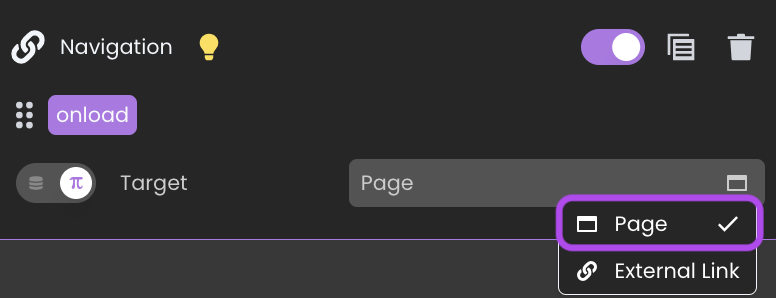
Binding Navigation Actions to Events
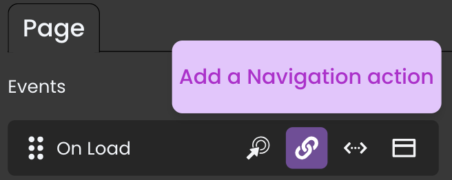
The navigation target can be defined in two ways using the toggle  :
:
 Qodly Sources: When the destination Page or external link is generated through server-side business logic. In such cases, provide a qodlysource of type string.
 Hardcoded values: When selecting a Page from the Pages list or providing a direct link as a hardcoded value.
Pages
To set up a navigation action after linking it with an event, proceed as follows:
- Choose Target Type: Select the "Page" option.
Either:
Specify Target Pages for "Qodly Source" type targets: Enter the string-type qodlysource containing the name of the intended Page.
Explore Target Pages for "Hardcoded Value" type targets: Browse through the list of available Pages, each serving as a potential navigation destination.
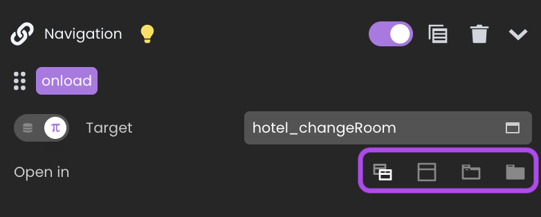
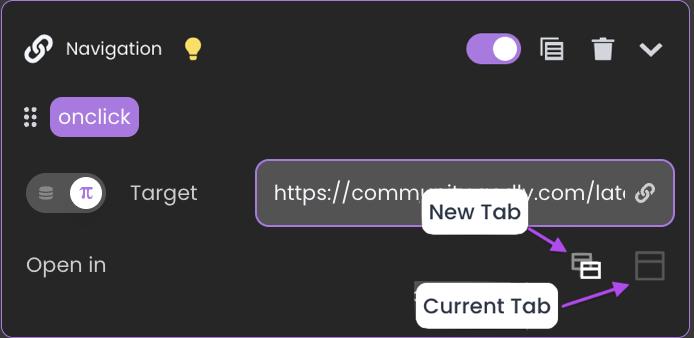
Define Transition Method: Define the approach through which the target Page will be presented based on the following options:
-
New Tab: Induce the opening of a new browser tab. -
Current Tab: Replace the ongoing browser tab with the chosen Page. -
Page Loader: Access the intended Page through a dedicated Page loader. -
Page Loader (Self): Reveals content within the existing Page loader .
-
The feature for providing feedback is not applicable in the context of navigation events.
External Links
In addition to navigating to Pages, Qodly Studio offers a convenient way to direct users to external links. The process follows the same steps as outlined for associating navigation actions with events for Pages, with a slight variation in the "Target Type" step:
- Choose Target Type: Select the "External Link" option and input the URL of the desired external link.
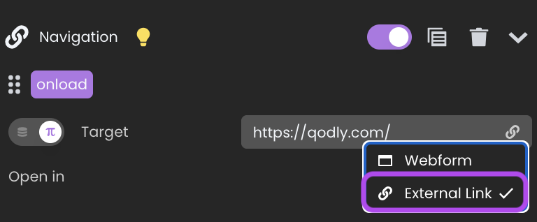
- Define Transition Method: Similar to configuring Page navigation, you can specify how the external link will open. However, for external links, you have two options:
- New Tab: Induce the opening of a new browser tab.
- Current Tab: Replace the ongoing browser tab with the chosen external link.
Shared Folder
Accessing content stored in the Shared folder follows a process similar to navigating to external links. You have the option to display items from this folder, like images, in either a new tab or the current tab by specifying the image path (e.g., /$shared/visuals/banner.png) in the target field. Ensure that the path begins with /$shared.
When the path points to a file, it doesn't open it in a new tab but instead initiates a download.
Binding Class Functions to Events
Class Functions
Select a Function: Browse the available functions and select an appropriate class function. You can link events to various types of class functions, including datastore class functions, dataclass class functions, entity class functions, entity selection class functions, and singleton class functions.
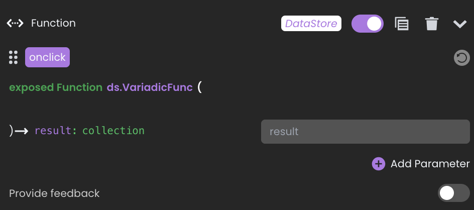
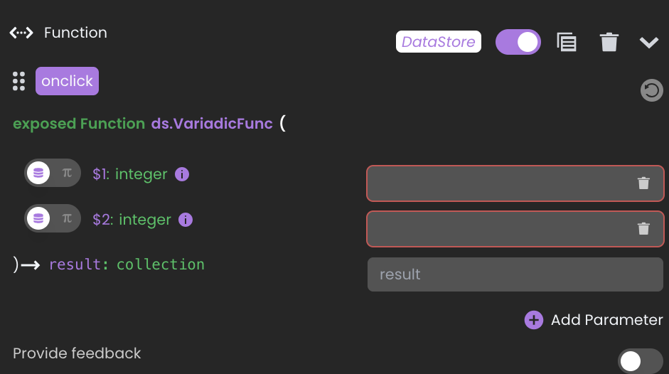
Pass Parameters: After selecting a class function, Qodly Studio automatically parses it, extracting its declared prototype. This allows you to visualize and configure its parameter(s) and return value. You can enhance the functionality of class functions by configuring parameters in two ways using the toggle
to define how the function parameter(s) should be filled, including the option to have variadic parameters.
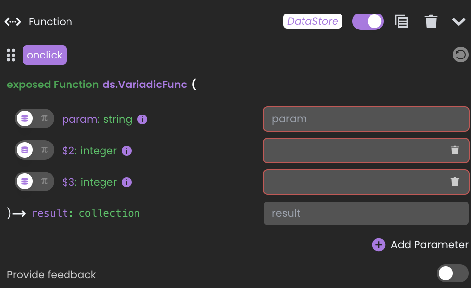
- Select a qodlysource for the returned result: In the return parameter section, choose a qodlysource to store the function's returned result.
- If your class function defines a specific variable for the result, its name will be displayed in the label within the return parameter section.
- However, if your class function does not specify a result name, the default label
resultwill be used in the return parameter section.

- Add Parameter: If your function accepts a variable number of parameters, you can use this button to declare and bind one or more appropriate parameter(s). They will be passed to the function in the defined order when called for the event.

- Provide Feedback: Enable the
Provide Feedbackcheckbox to display backend feedback on the user interface. For more detailed information, refer to the Provide Feedback section.
A single class function can be utilized across multiple events, allowing you to assign multiple events to a single function and observe a coordinated sequence of actions taking place.
Function Parameters & Variability
Parameter Handling
There are two primary methods for ensuring precise parameter handling:
- Hardcoded values: Provide various types of values directly to the class function as parameters by selecting the type through the value icon
 . Whether it's a string, number, boolean, or any other supported data type, simply choose the desired type from the dropdown list ensuring compatibility with the expected parameter type for precise and accurate results.
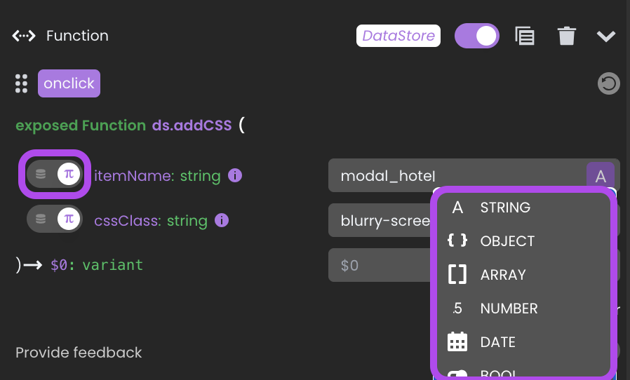
- The following types are supported as hard-coded values:
| Type | Description | Example |
|---|---|---|
| String | Any string value | Hello World |
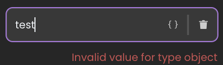
| Object | JSON syntax | {"age": 12, "name": "Smith"} |
| Array | Collection of values | [10, 20, 30] |
| Number | Any numeric value | 42 |
| Date | A short-format date | 20/12/2024 |
| Boolean | True or False | False |
- Qodly Sources: Pass Local or Shared Qodly Sources as parameters to the class function. The scope of the qodlysource is indicated by a name tag. If the tag reads
Page, it signifies a local qodlysource visible only within the current Page. On the other hand, if there is a tag with a specific nameshared, it implies that you have passed a shared qodlysource belonging to a namespace.
Make sure the qodlysource value is of the same type as expected for the parameter by the function, otherwise an error will be returned.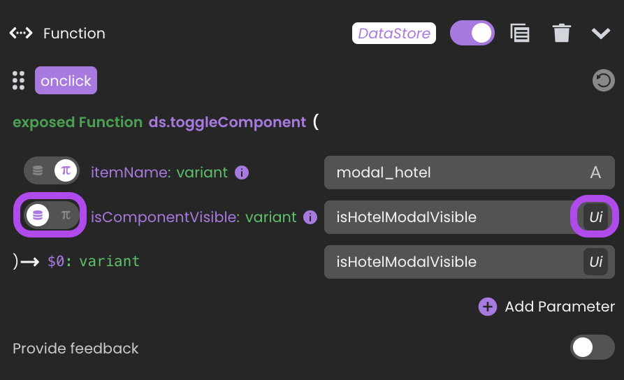
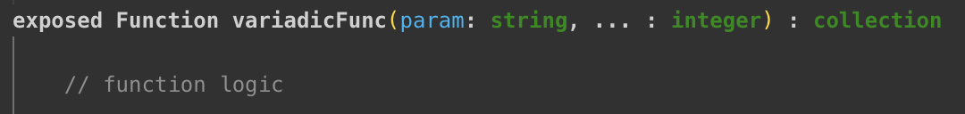
Variadic Parameters
... notation in function prototypes to handle a variable number of parameters.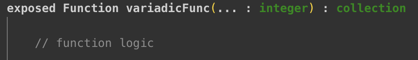
Reloading the Event Function Prototype after changing one of the parameter types resets them to match the updated information.
Binding Dialog Actions to Events
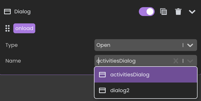
Add a dialog action in a component's event configuration, you can define the following: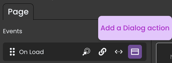
- The type of action:
- Open: This action causes the dialog to be displayed.
- Close: This action leads to the closing of the dialog.
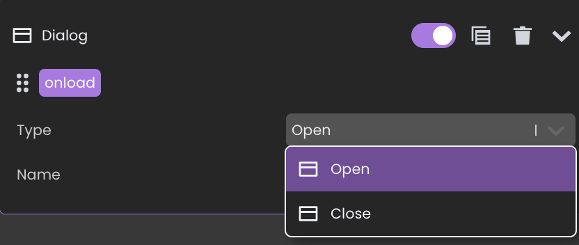
- The name of the dialog to be affected by this interaction.
For further details, refer to the Dialog section.
Providing feedback
To provide feedback within the user interface, enable the Provide Feedback checkbox. This feature allows the backend to communicate with the user by displaying relevant messages regarding the outcomes of different functions or standard actions.
Importantly, this customized feedback aligns with the application's business rules and does not disrupt the application's navigation flow.
Toast Notifications
When the Provide Feedback checkbox is enabled, it introduces a hidden internal feedback element into the web page, known as a toast notification. This element automatically showcases messages generated by the application code in response to events, using dedicated Page functions or by specifying them for On Success or On Failure in the Page Editor interface, for the case of standard actions.
If this feature is not enabled, feedback sent from the backend will not be displayed within the user interface.
Control of Feedback Display
The Provide Feedback checkbox offers manual control over the display of feedback messages when executing a specific function. This manual control is designed to determine when to provide and display feedback, ensuring that messages precisely align with the specific needs of the user and the context.
For example, in the context of a technical document, regular users may require feedback messages to stay informed about the status of their requests, such as waiting for admin approval. However, administrators using a different interface to make modifications to the same technical document, which invokes the same function, might not need to receive the same message due to their administrative roles.
Three Tiers of Feedback
Three tiers of feedback are accessible and will be displayed as colored toasts:
Informative Messages: Dispatches informative messages when invoked, either directly through the
setMessage()function or by specifying them in theOn Successfield within the event section associated with a standard action.Cautionary Messages: Sends out cautionary messages, and these messages are exclusively triggered using the
setWarning()function.Error Messages: Issues error messages when invoked, either directly through the
setError()function or by specifying them in theOn Failurefield within the event section associated with a standard action.
Displaying multiple toasts through a single function is not supported.
Upon calling a function, it initiates an HTTP request, updating the UI simultaneously with the latest changes. This aligns with the principle that one HTTP request results in one response, leading to a single UI update.
Consequently, only the final update from the function will be visible in the UI, showcasing only the last toast.
The time these toast notifications remain visible is typically managed by Qodly Studio's internal logic.
They will automatically disappear after a preset 5-second period. Users can also manually dismiss them by clicking on the x icon.