Webform Editor
Creating a webform
In Qodly, a project's groundwork starts with a webform, which acts as the primary container integrating various components such as buttons and style boxes. There are three methods available for creating a webform:
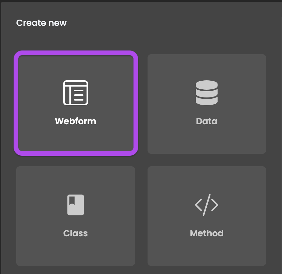
- On the Qodly Studio Homepage, select
Webformand name the new webform in the creation modal. - In the Explorer, simply click the plus icon located next to
Webforms. - While in the Webform Editor, go to the
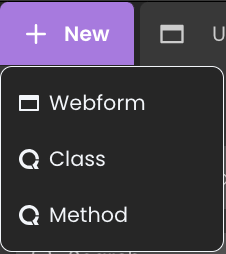
New +tab and opt forWebform.

Webform Editor Overview
The Webform Editor enhances your application by providing a versatile toolkit for interface and content customization:
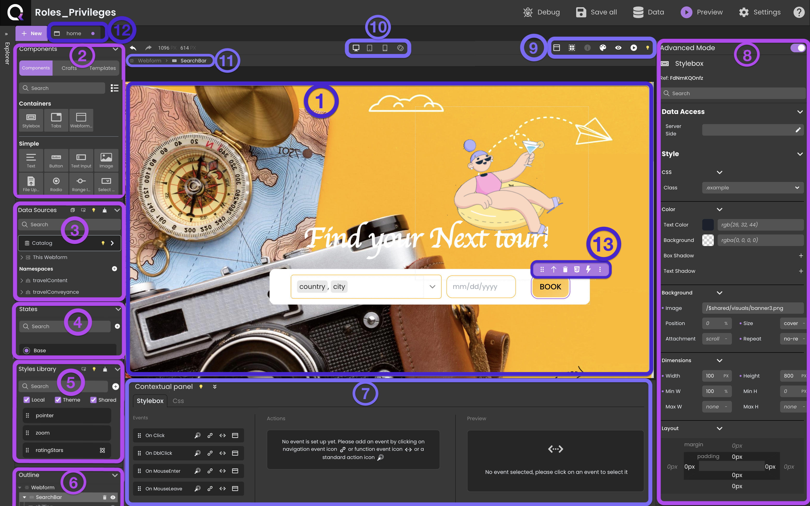
- Canvas: The workspace for assembling components, styles, and datasources. You can drag and drop components, apply CSS, and preview webforms.
- Components: Fundamental building blocks for dynamic user interfaces.
- Data Sources:Connectors linked to components for data display and management.
- States: Coming Soon.
- Styles Library: Stores pre-defined and customized styles for easy application.
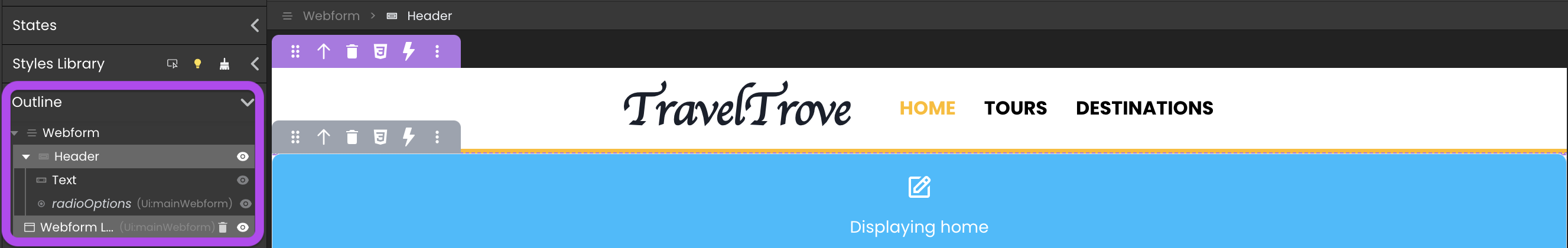
- Outline: Visual hierarchy representation, aiding structural understanding and element repositioning.
- Contextual panel: Binds functions, actions to events as well as serves as an interface for css class modifications.
- Properties panel: Customizes component attributes for tailored behavior and appearance.
- Header panel: Simplifies project management for streamlined tracking.
- Device toolbar: Coming Soon.
- Breadcrumbs: Displays component hierarchy for navigation.
- Tabs: Organizes open webforms and all other open elements, including class functions, model, etc.
- Tooltip: Offers efficient component management and manipulation actions.
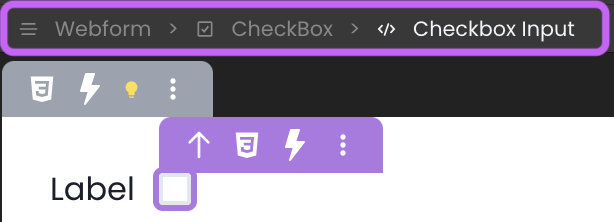
Breadcrumbs
Outline
 , toggling their display on or off as needed.
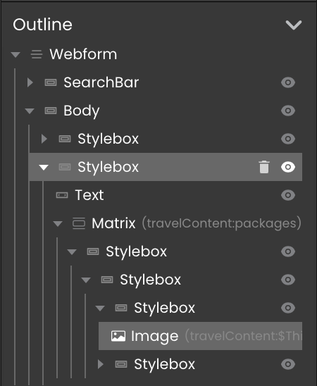
Header panel

Dialogs
The Dialog button  in the header panel provides access to a list of Dialogs. Each Dialog is designed as a popup overlay, aimed at enhancing user engagement by displaying additional content within the existing webform.
For further details, refer to the Dialog section.
Toggle Airy Layout
The Airy mode button  in the header panel is a feature that enhances the creation of user-friendly web forms. When activated, this mode automatically applies default margins between components, fostering a more spacious and aesthetically pleasing layout. By introducing gaps between form components, Airy mode streamlines the design process, producing visually appealing web forms with minimal need for manual style adjustments.
To reflect the selected mode, a toggle is incorporated on the canvas, allowing developers to switch between Airy mode and Neutral mode.
The initial state of the toggle is context-dependent, adapting to the specific form being worked on.
Sanity Check
The Sanity Check button  in the header panel plays a role in upholding the integrity and consistency of your Webforms. It is automatically engaged when editing an open webform.
When the form is error-free, the icon appears as , serving as a vital signifier of the form's health.
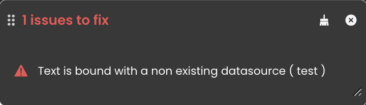
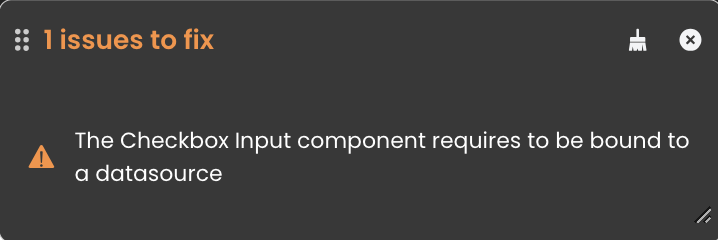
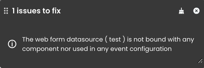
When discrepancies arise, the icon's color changes to reflect the error category. By clicking on this icon, you gain access to a comprehensive analysis of the issues, organized into three distinct categories:
- Errors: Errors are displayed in red and occur, for instance, when a component is linked to a non-existent data source.
- Warnings: Warnings are shown in yellow, such as when a component needs to be bound to a data source.
- Informational: Informational notices are in grey, like when a data source is created but not utilized.
The Sanity Check serves as an informative tool. Even if errors are present, a webform can still be saved.
Datasources Color
The Datasources Color button  in the header panel allows easy identification of the background color of datasources linked to a component.
Preview
The Preview buttons  and
and  in the header panel render a webform either directly in Qodly Studio or using the webform URL.
For further details, refer to the Rendering a webform section.
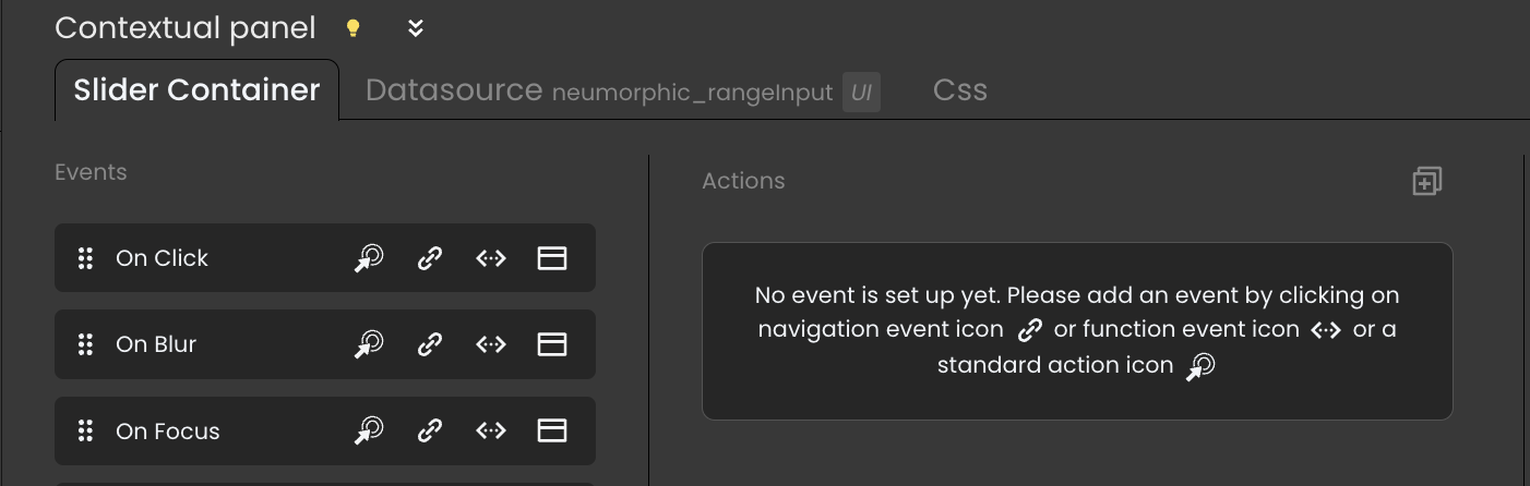
Contextual panel
The Contextual Panel is a multifaceted interface, consisting of three distinct tabs: the Component tab, the Datasource tab, and the CSS tab.
The intuitive design of Qodly includes a feature that memorizes the last active tab in the Contextual Panel. When there is a switch between components, the panel automatically displays the last tab that was in use.
Component Tab
Datasource Tab
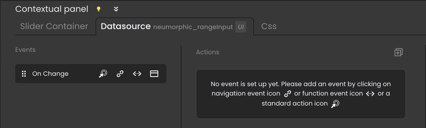
The Datasource tab becomes accessible only when a component is linked to a datasource.
CSS Tab
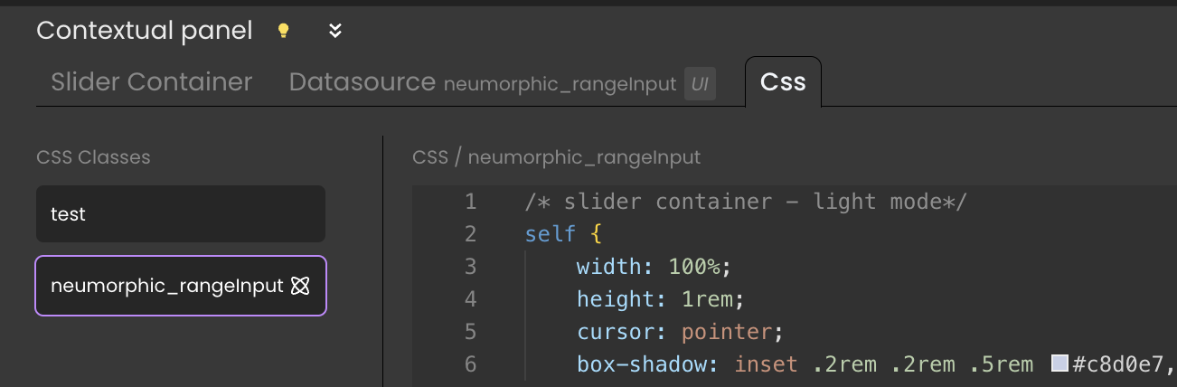
CSS Class Deletion: Direct deletion of CSS classes from the Contextual Panel is not possible. For complete removal, navigate to the Styles Library.
Removing CSS Classes from Components: Unapplying a CSS class from a component requires alterations in the component's Properties Panel, not via the Contextual Panel.
For further details about styling components, refer to the Styling section.
The CSS tab becomes accessible only when there are CSS classes applied to a component.
Properties panel
The Properties panel is a powerful tool for customizing a wide array of component attributes, enabling you to shape their behavior and appearance to suit your needs. The available properties are contingent upon the specific component you have selected.
Display Modes
The Properties Panel offers a pair of distinctive modes:
- Standard mode: This mode presents a concise and straightforward view, ideal for configuring essential properties swiftly. Utilize it to quickly set up key attributes for your webform components.
- Advanced mode: In this mode, a comprehensive view showcasing all available properties is provided. Choose this mode for intricate property definition, enabling meticulous configuration of design choices and parameters.

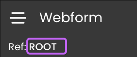
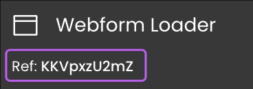
Component Reference (Ref)
 .
.
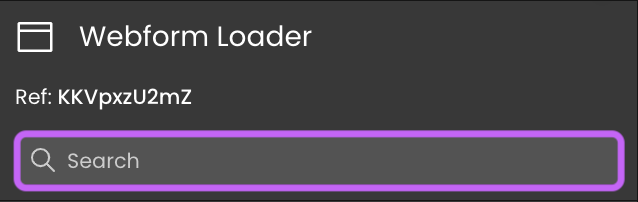
Search box
Properties Category
Enhance a component to align with your application's requirements using the available customization options, depending on the component selected.
Each component's documentation contains its own dedicated section explaining these customization possibilities.
Data Access Category
Configure the interaction between your chosen component and its associated datasource, if applicable. These property details are extensively covered in the Datasources section.
The Data Access properties encompass distinct options and fields tailored to each specific component, including:
- DataSource: Identifies the data source for component iteration.
- Selected Element: Specifies the currently selected element within the component.
- Iterate with: Utilizes a datasource for looping through the same dataset.
- Server Side: Provides the means to exercise server-side control over a component's behavior. This involves assigning a
Server Sidereference, essentially an "address" on the server, to a specific component. By doing so, you enable the utilization of this reference in class functions, thereby governing the component's actions.
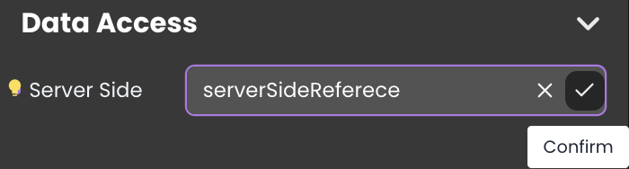
Server Side allows you to control the component's behavior, such as hiding, showing, adding CSS classes, or removing CSS classes from it.
Style Category
Discover numerous customization avenues that empower you to fine-tune components according to distinct needs.
Every style property is visible for all components, even though specific properties, like text alignment under the Font category for the icon component, will not impact the appearance of the component.
Explore below for specific options:
| Section | Description |
|---|---|
| CSS | The CSS class contains styles influencing visual attributes, affecting the component's appearance and positioning. Refer to the Styles Library for additional details. |
| Color scheme | Customize the component's color palette including background colors, text colors, and box shadows. |
| Background | Assign a background image to the component with options like position, size, attachment, and repeat settings. If you use a picture stored in the Shared folder, you can drag and drop the file on the property area to enter its path automatically (e.g., /$shared/visuals/background.png). |
| Dimensions | Define component dimensions: width, height, and other size properties for seamless integration into the webpage layout. |
| Layout | Gain control over component alignment using margins and paddings. |
| Appearance | The appearance attribute covers position (e.g., relative, absolute), overflow behavior, and display styles (e.g., block, flex), shaping component presentation and interaction. |
| Font | Tailor font type, size, alignment, and style achieving desired textual visual style. |
| Borders | Define borders using attributes like thickness, color, and style to visually distinguish the component. |
| Border radius | Adjust component corner curvature for various shapes and styles. |
Reset Value.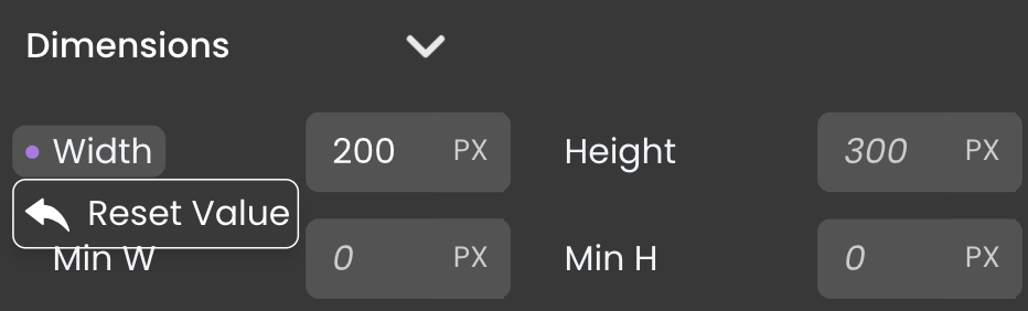
Webform JSON Representation
This representation can be accessed through a text editor by selecting the webform in the
Explorer and choosing Open With a Text Editor.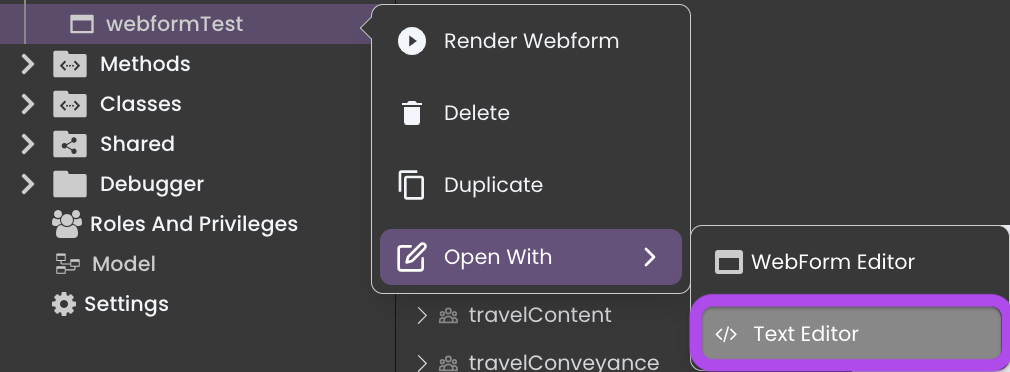
Purpose
The JSON representation serves as a fundamental blueprint for the webform. Its primary purposes include:
Secure Preservation: It securely preserves the webform in a structured, machine-readable format.
Consistent Modification: It simplifies the process of modifying component-related details to customize the webform, resolve issues, or perform global search and replace operation.
Easy Replication: It allows users to effortlessly replicate the entire webform, including its design and functionality, by copying and pasting it into another web form's text editor.
This process ensures the seamless replication of even local datasources and locally defined CSS classes, guaranteeing a consistent visual style and behavior across the target webform.
Example
Let's explore the JSON representation of a webform that includes a Webform Loader component and a Stylebox component encapsulating a Text component and a Radio component.
The JSON representation of the webform is structured as follows:
{
  "metadata": {
    "v": "1.0",
    "datasources": [
      {
        "id": "homeWebform",
        "type": "scalar",
        "namespace": "",
        "dataType": "string",
        "initialValue": "home"
      },
      {
        "id": "version",
        "type": "scalar",
        "namespace": "",
        "dataType": "string",
        "initialValue": ""
      }
    ],
    "styles": [
      {
        "name": "comforterBrush",
        "content": "self {\n\tfont-family: \"Comforter Brush\", cursive !important;\n}",
        "parentId": null,
        "id": "Ub8fl59kqIYbend2op18M"
      }
    ]
  },
  "components": {
    "ROOT": {
      "type": {
        "resolvedName": "Container"
      },
      "isCanvas": true,
      "props": {
        "classNames": [],
        "events": [
          {
            "type": "method",
            "dataclass": "DataStore",
            "events": [
              "onload"
            ],
            "id": "77VxabQYTbMyky6JW2MmJm",
            "method": "ds.loadUser",
            "params": [],
            "returns": {
              "name": "$0",
              "type": "Variable",
              "datasource": "userManagement:user"
            }
          }
        ],
        "className": "bg-white h-full w-full px-6",
        "airyMode": false,
        "style": {
          "paddingTop": "0px",
          "paddingRight": "0px",
          "paddingBottom": "0px",
          "paddingLeft": "0px"
        },
        "serverSideRef": "webformRef"
      },
      "displayName": "Webform",
      "custom": {},
      "parent": "",
      "hidden": false,
      "nodes": [
        "JT1BLTebtT",
        "bXx3gBHhJA"
      ],
      "linkedNodes": {}
    },
    "JT1BLTebtT": {
      "type": {
        "resolvedName": "StyleBox"
      },
      "isCanvas": true,
      "props": {
        "events": [],
        "style": {
          "backgroundColor": "#ffffffff",
          "display": "flex",
          "paddingLeft": "0px",
          "paddingRight": "0px",
          "gap": "20px",
          "paddingTop": "0px",
          "paddingBottom": "0px",
          "borderBottomColor": "#FFBC00",
          "borderBottomWidth": "4px",
          "alignItems": "center",
          "justifyContent": "center",
          "flexWrap": "wrap",
          "alignContent": "center",
          "width": "100%",
          "minWidth": "100%",
          "height": "10%"
        },
        "serverSideRef": ""
      },
      "displayName": "Stylebox",
      "custom": {
        "displayName": "Header"
      },
      "parent": "ROOT",
      "hidden": false,
      "nodes": [
        "0aNlvNGY8X",
        "KeLZVvKaHp"
      ],
      "linkedNodes": {}
    },
    "0aNlvNGY8X": {
      "type": {
        "resolvedName": "Text"
      },
      "isCanvas": false,
      "props": {
        "events": [],
        "doc": [
          {
            "type": "paragraph",
            "children": [
              {
                "text": "TravelTrove ",
                "italic": false,
                "underlined": false,
                "strikethrough": false,
                "bold": true
              },
              {
                "type": "datasource",
                "datasource": "version",
                "children": [
                  {
                    "italic": false,
                    "underlined": false,
                    "strikethrough": false,
                    "bold": true,
                    "text": "v"
                  }
                ],
                "dsType": "string",
                "format": ""
              },
              {
                "text": ""

              }
            ]
          }
        ],
        "datasource": "version",
        "style": {
          "fontSize": "40px",
          "textAlign": "center",
          "fontFamily": "New Tegomin",
          "paddingLeft": "10px",
          "paddingRight": "10px",
          "paddingBottom": "10px",
          "paddingTop": "10px"
        },
        "classNames": [
          "comforterBrush"
        ],
        "serverSideRef": "textRef"
      },
      "displayName": "Text",
      "custom": {},
      "parent": "JT1BLTebtT",
      "hidden": false,
      "nodes": [],
      "linkedNodes": {}
    },
    "vQwIVqfzaG": {
      "type": {
        "resolvedName": "StyleBox"
      },
      "isCanvas": true,
      "props": {
        "events": [],
        "style": {
          "minHeight": "40px",
          "display": "flex",
          "alignItems": "center"
        }
      },
      "displayName": "Stylebox",
      "custom": {},
      "parent": "vt5ll-8J-n",
      "hidden": false,
      "nodes": [],
      "linkedNodes": {}
    },
    "KeLZVvKaHp": {
      "type": {
        "resolvedName": "Radio"
      },
      "isCanvas": false,
      "props": {
        "classNames": [
          "radio-selectedItem"
        ],
        "events": [],
        "defaultValue": "home",
        "mode": "single",
        "type": "tabs",
        "options": [
          {
            "label": "HOME",
            "value": "home",
            "id": "8SFueBkpxWtmqTmEHa92ew"
          },
          {
            "label": "TOURS",
            "value": "tours",
            "id": "fLxd7NcKBA9xzUTwf8NXPj"
          },
          {
            "label": "DESTINATIONS",
            "value": "destinations",
            "id": "f9mqtjJG2nap5EJKaMqKM5"
          }
        ],
        "datasource": "Ui:mainWebform",
        "style": {
          "color": "#000000ff",
          "textTransform": "uppercase",
          "fontWeight": "700"
        },
        "serverSideRef": "radioOptionsRef"
      },
      "displayName": "Radio",
      "custom": {},
      "parent": "JT1BLTebtT",
      "hidden": false,
      "nodes": [],
      "linkedNodes": {}
    },
    "bXx3gBHhJA": {
      "type": {
        "resolvedName": "WebformLoader"
      },
      "isCanvas": false,
      "props": {
        "events": [],
        "style": {
          "width": "100%",
          "height": "90%",
          "paddingLeft": "0px",
          "paddingRight": "0px",
          "paddingBottom": "0px",
          "paddingTop": "0px"
        },
        "datasource": "Ui:mainWebform",
        "webform": "home",
        "classNames": [],
        "serverSideRef": "webformLoaderRef"
      },
      "displayName": "Webform Loader",
      "custom": {},
      "parent": "ROOT",
      "hidden": false,
      "nodes": [],
      "linkedNodes": {}
    }
  }
}
Dissection
The JSON representation of the webform consists of two major elements: metadata and components.
metadata: Contains metadata related to the webform.
v: Version of the webform.datasources: An array of local datasources scoped to the webform, with the following sub-attributes:id: Identifier for each datasource.type: Specifies the type of the datasource.namespace: Denotes the namespace of the datasource, which is empty if the datasource is local.dataType: Represents the data type of the datasource.initialValue: Indicates the initial value of the datasource name.styles: An array of local css classes scoped to the webform. It includes the following sub-attributes:name: Name of the css class.content: The actual CSS content of the CSS class.parentId: Identifier of the parent CSS class, if applicable.id: Unique identifier for each CSS class.scope: Defines the scope in which the style operates, remaining local at all times, as the styles exclusively represent an array of local CSS classes confined to the webform.
components: Represents the individual components used in the webform. Each component shares these common attributes:
type:resolvedName: Specifies the component's type.
isCanvas: Indicates if the component functions as a canvas.props:classNames: An array of CSS classes applied to the component, whether they are local, shared, or theme-specific.events: An array of events associated with the component.style: Defines CSS styling properties for the component.serverSideRef: Refers to a server-side resource.
displayName: Represents the name of the component.custom:displayName: The name of a custom component, particularly when it's a component used from existing templates.
parent: Identifies the parent component.hidden: Indicates if the component is hidden.nodes: An array of child components nested within the current component.linkedNodes: An object of component elements linked to this particular component.
infoEach specific component may have additional attributes under the
propssection, such as airyMode for theROOTcomponent, or other component-specific details.Specific components may have additional attributes under the
propssection, like:ROOT (Container):
className: The CSS class name for styling.airyMode: Indicates whether airy mode is enabled for the webform.
0ANLVNGY8X (TEXT):
doc:type: Describe the type of the Text component.children:type: If this attribute is visible with a value of "datasource", it means that portion of the text content is bound to a datasource. If not, then it's static text.datasource: The name of the datasource bound to the portion of the text content.children: Specifies the text content visual formatting.dsType: The data type of the datasource.format: Specifies the data formatting for the datasource.
datasource: The name of the datasource bound to the component.
KELZVVKAHP (RADIO):
defaultValue: Sets the default value for the radio.mode: Specifies the radio selection mode.type: Determines the display type of the radio.options: Lists the available radio options.datasource: The name of the datasource bound to the component.
bXx3gBHhJA (Webform Loader):
webform: The name of the webform set as an initial value.datasource: The name of the datasource bound to the component.
Syntax Check
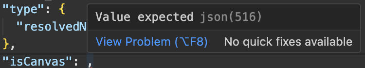
The syntax check identify and rectify syntax errors and other formatting issues within the JSON representation. These errors are not only highlighted but also accompanied by descriptive messages that facilitate pinpointing the exact problem. Below are some common examples of syntax errors that can be detected:
- Expected comma: This error typically occurs when a comma
,is absent between key-value pairs in an object or elements in an array.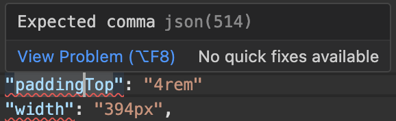
- Expected closing brace: This error occurs when the parser anticipates a closing curly brace
}to conclude an object but does not find it.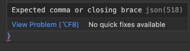
- Value expected: This error arises when an object key is succeeded by a colon, but the corresponding value is missing, indicating an incomplete JSON representation.
- Colon expected: This error suggests that a colon
:is required to separate the key and value in an object, but it is missing from the code.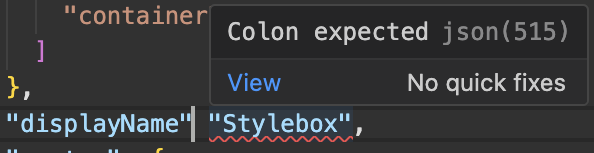
- Unexpected end of string json: This error is triggered when the parser encounters the end of a string without coming across a closing double quote
", indicating an unfinished string value or when the opening double quote is missing at the beginning of the string.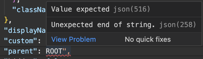
It is essential to exercise caution when editing the JSON representation, as the syntax check does not validate whether attribute names match the expected ones or if there are issues with the attribute names. Similarly, it does not necessarily catch issues where a boolean value is used in place of a string value.
These discrepancies may not trigger errors, but they can potentially corrupt your webform or, in more severe cases, break it until the errors are rectified. Therefore, thorough validation of attribute names and values is crucial to ensure the integrity and functionality of your webform.