Dialog
A Dialog is an interactive, dynamic UI element designed as a popup overlay to streamline user engagement by rendering additional content or forms within the existing page context.
Dialog Creation
To initiate a dialog, navigate to the edited web form header panel and select the Dialogs button  .
.
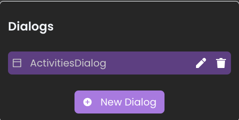
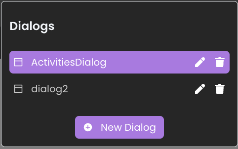
There are no configured Dialogs yet. However, once dialogs are created, they will be listed under this section.To create a new dialog, click on the
New dialog button within this panel.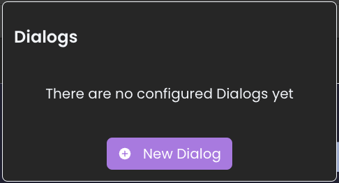
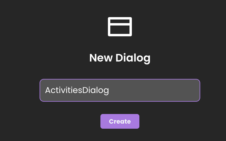
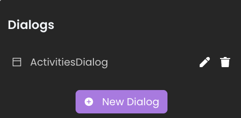
After naming and confirming with the create button, the new dialog will appear both in the dialog's list and within the outline view.
At runtime, dialogs are displayed at the center of the page.
Dialog Deletion
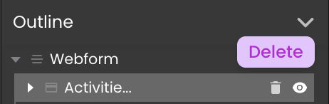
There are two ways for removing Dialogs:
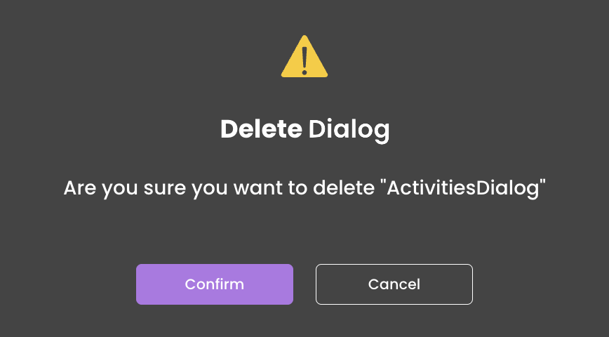
- Dialogs List: Click on the delete icon
 next to the dialog you intend to delete in the dialogs listt.
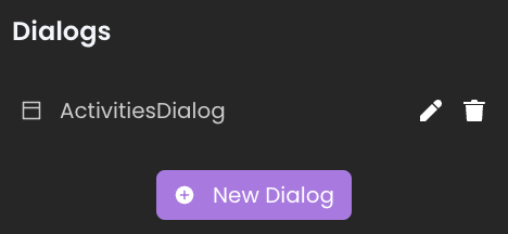
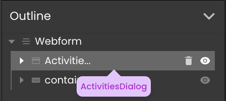
- Outline section: As an alternative method, dialogs can also be removed directly from the outline section..
Dialog Renaming
 next to the desired dialog in the dialogs list. This action activates the edit mode within the same interface, allowing you to rename the dialog.
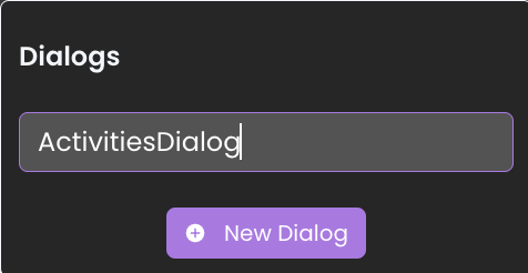
Dialog Content Editing
Each dialog includes a style box that enables the integration and customization of various components. Components can be dragged and dropped directly into this style box, allowing for efficient customization of the dialog's appearance.
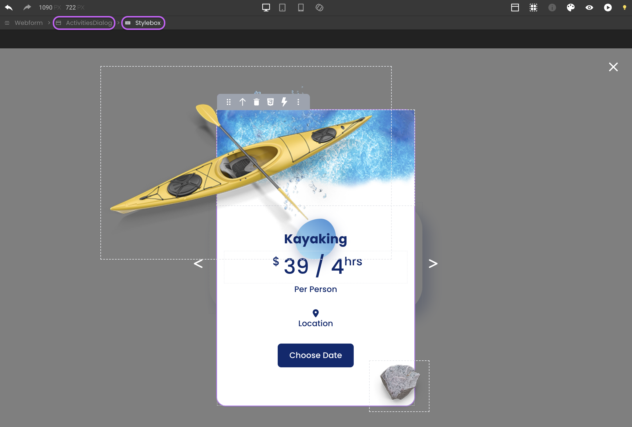
To exit the dialog's editing mode, click the close button  located at the top right corner.
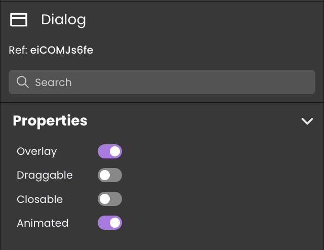
Properties Customization
Enhance the Dialog component to align with your application's requirements using the following customization options:
- Overlay (Boolean): Activates a screen overlay when set to true.
- Draggable (Boolean): Enables user-driven repositioning. Features a customizable move icon
 .
.- Closable (Boolean): Integrates a close function, operable via the button or by clicking outside the dialog (if overlay is enabled). Features a customizable close icon
 .
.- Animated: Implements an opening flicker effect for visual emphasis.
Server-Side Interaction
Every dialog is uniquely named, which acts as its server-side reference for server-side interactions. This allows you to control the Dialog's behavior, such as hiding, showing, adding CSS classes, or removing CSS classes from it.
Employing the .show() method triggers the On Open event, whereas utilizing .hide() triggers the On Close event.
Display and Customization
The overlay style of dialogs can be further styled using the shared CSS class fd-dialog-overlay, such as:
self {
    background-color: rgba(137, 43, 226, 50%);
}
This shared CSS class takes precedence and cannot be superseded by any locally defined classes of the same name.
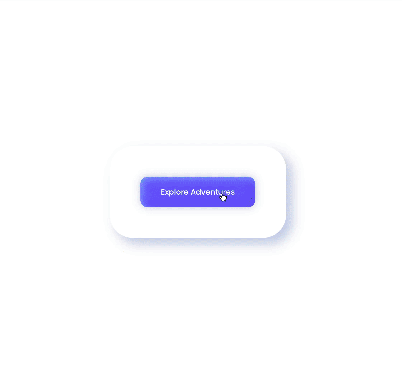
Showcase
Here's a glimpse of how the Dialog component will look and behave in action:
Triggers and Events
The Dialog component can respond to various events, enabling dynamic user experiences. Events that can trigger actions within the component include:
| Event | Description |
|---|---|
| On Init | Calls for an action when the dialog initially opens. It is used for the dialog's initialization. |
| On Loaded | Calls for an action once the dialog has completely mounted/loaded, indicating readiness for interaction. |
| On Close | Calls for an action to be performed just before the dialog is closed. |
In scenarios where the Dialog includes a Webform Loader, these events are triggered before the On Load actions of the Webform Loader.