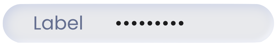
Text Input
The Text Input component is an interactive UI element that enables user interactions by allowing the input of alphanumeric data within a webform. With support for various input types, this component accommodates diverse data entry scenarios.
The Text Input component contains an embedded Input and a Label element. This is of great importance as configuring the Text Input component may require adjusting properties within the embedded elements. This applies to the visual style, triggers, and actions as they may differ.
Use Cases
The Text Input component provides a versatile solution for a wide range of scenarios:
User Profile Management: Users can update their personal information, such as names, contact details, and addresses, ensuring accurate and up-to-date records.
Data Filtering: Users can input search criteria, making it easier to locate specific records within large datasets.
Comments and Notes: Employees can leave comments, feedback, or additional information on records, facilitating efficient communication and collaboration.
Properties Customization
Text Input Component
Enhance the Text Input component to align with your application's requirements using the following customization options:
- Label Position: Developers can tailor the label's position, placing it above, below, to the left, to the right, or even hidden.

Embedded Label
Within the Text Input component, an embedded Label allows for further customization of the following properties:
- Label: Personalize the label to offer clear instructions or guidance.

Embedded Input
Within the Text Input component, an embedded Input allows for further customization of the following properties:
- Placeholder: Set a placeholder to provide users with a hint or example of the expected input. This text appears within the input field and disappears as soon as users begin typing.
- Input Type: Select the appropriate input type to match the nature of the expected data. Available types include:
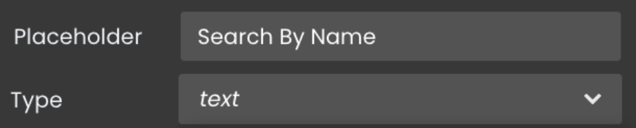
- text: Standard alphanumeric data.
- text area: Larger text area for expanding and adjusting size.
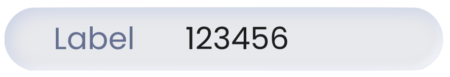
- number: Numerical values only.
- password: Concealed input for sensitive data.
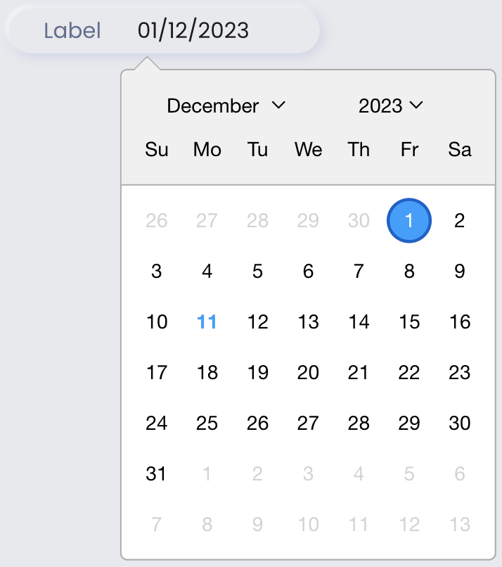
- date: Limits input to date values with a date picker.
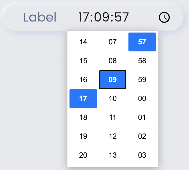
- time: Limits input to time values with a widget for selection, allowing scrolling or clicking to choose values
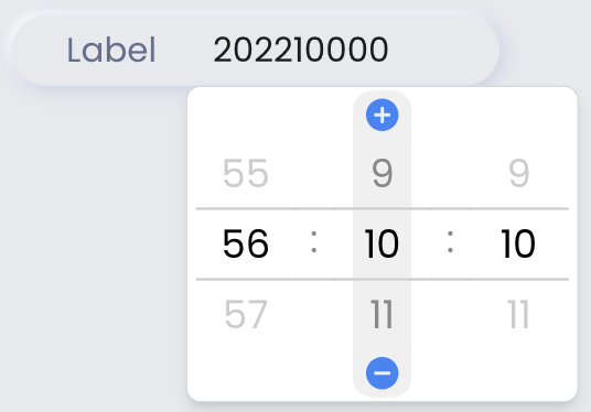
- duration: Limits input to duration values with a widget, enabling scrolling, manual entry, or using the + and - icons.
- Input Format: Specify the desired format for the entered data.
See Formats for a description of available formats.
- Read-Only Option: Toggle the readOnly property to prevent users from editing the input content. This is useful when displaying pre-filled or calculated data that should not be modified.

Data Integration
The Text Input component allows for seamless integration of datasources, enabling dynamic data binding and interaction within the webform.
The datasource for the Text Input component should be of type text, number, date, or duration.
Data Binding
To associate data with the Text Input component, follow these steps:
- Navigate to the Properties Panel: Access the Data Access category located within the Properties panel for the Text Input component.
- Define the Datasource: Specify the appropriate Datasource that contains the data you want to display within the Text Input or retrieve from user input. This can be an attribute from an entity, an array, or a direct datasource of type text. For instance, you can select an entity, such as
package.
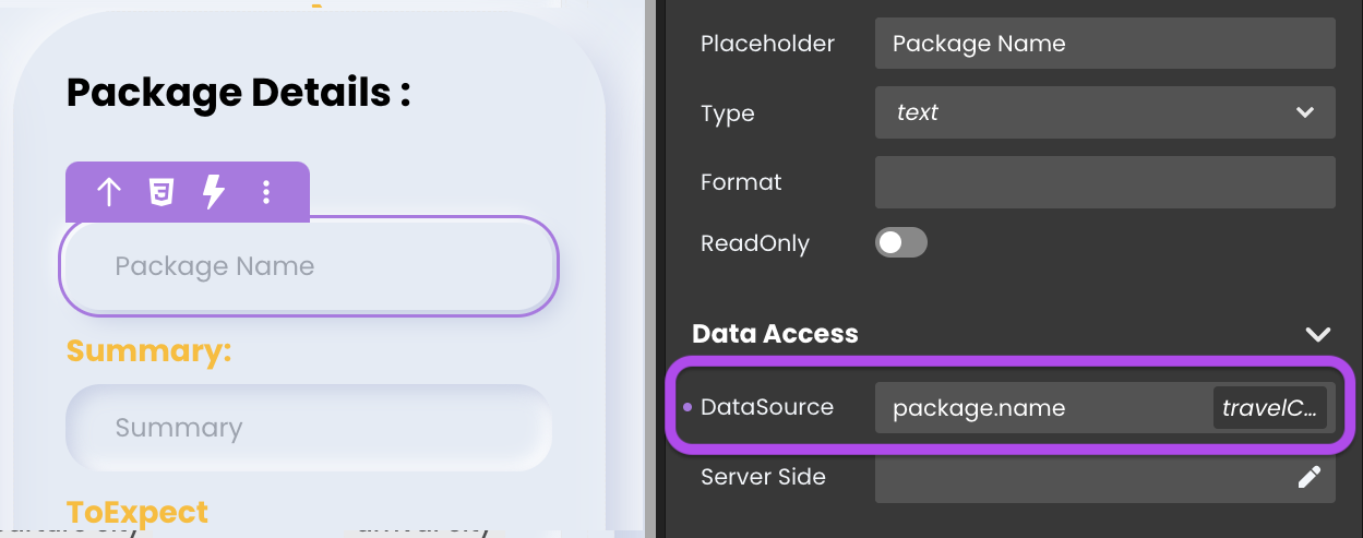
- Choose the Attribute: Choose the specific attribute that you want to display within the component when using an entity or an array type datasource, such as
package.name.
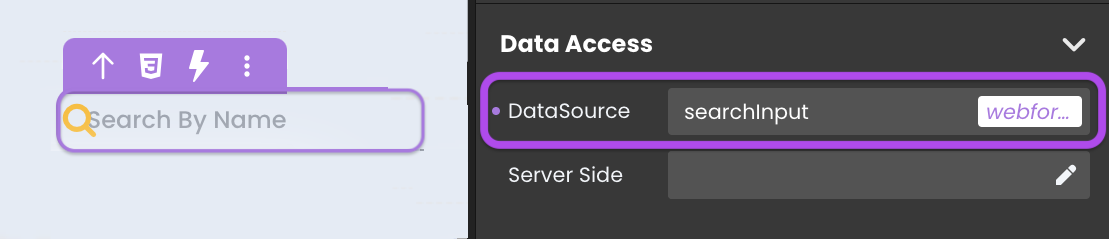
Alternatively, you can establish the connection by dragging and dropping the datasource onto the Text Input component.
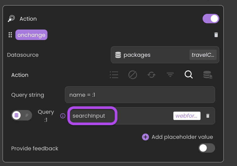
Server-Side Interaction
Retrieving user input data is equally effortless. By binding a datasource to the Text Input component, you can access and employ user-entered content.
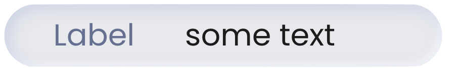
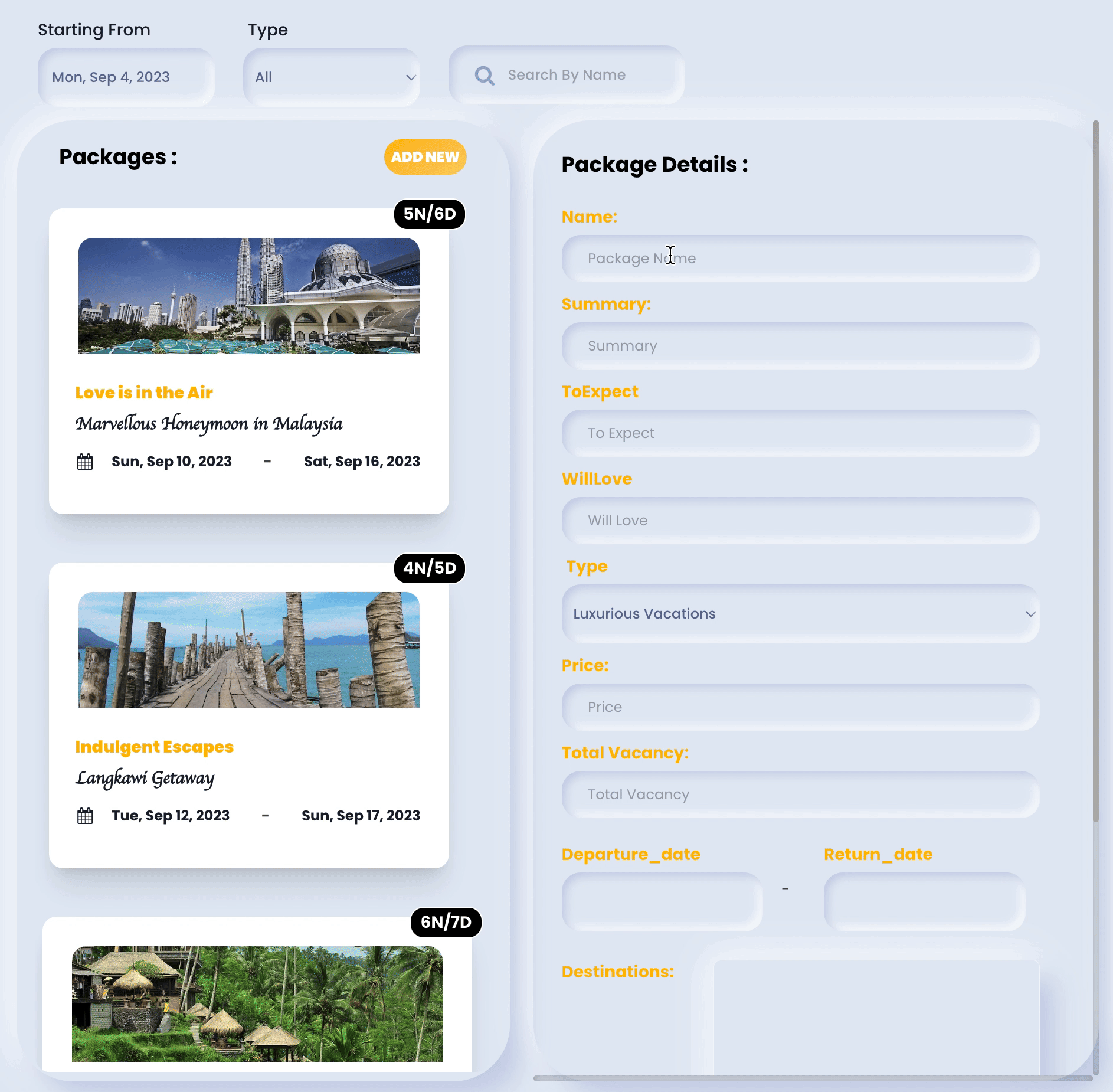
Showcase
Here's a glimpse of how the Text Input component will look and behave in action:
Triggers and Events
Text Input Component
The Text Input component can respond to various events, enabling dynamic user experiences. Events that can trigger actions within the component include:
| Event | Description |
|---|---|
| On Click | Calls for an action when the user clicks on the component. |
| On MouseEnter | Calls for an action when the user's mouse cursor enters the area of the component. |
| On MouseLeave | Calls for an action when the user's mouse cursor exits the area of the component. |
Embedded Input
The embedded Input can also respond to various events, allowing for dynamic user experiences. Events that can trigger actions within the embedded icon include:
| Event | Description |
|---|---|
| On Change | Calls for an action when the value of the Input changes. This typically occurs when the user enters or modifies text in the Input field. |
| On Click | Calls for an action when the user clicks on the Input. |
| On Keyup | Calls for an action when a keyboard key is released while the Input is in focus |
| On KeyDown | Calls for an action when a keyboard key is pressed down while the Input is in focus. |
| On AuxClick | Calls for an action when the user performs an auxiliary action (e.g., right-click or middle-click) on the Input. |
| On Blur | Calls for an action when the Input loses focus (user clicks outside). |
| On Focus | Calls for an action when the Input gains focus (user clicks on it). |
| On MouseEnter | Calls for an action when the user's mouse cursor enters the area of the Input. |
| On MouseLeave | Calls for an action when the user's mouse cursor exits the area of the Input. |
Embedded Label
The embedded Label can also respond to various events, allowing for dynamic user experiences. Events that can trigger actions within the embedded icon include:
| Event | Description |
|---|---|
| On Click | Calls for an action when the user clicks on the Label. |
| On Keyup | Calls for an action when a keyboard key is released while the Label is in focus |
| On KeyDown | Calls for an action when a keyboard key is pressed down while the Label is in focus. |
| On MouseEnter | Calls for an action when the user's mouse cursor enters the area of the Label. |
| On MouseLeave | Calls for an action when the user's mouse cursor exits the area of the Label. |