Select Input
The Select Input component is an interactive UI element that allows users to pick an option from a predefined list using a dropdown-style interface. Users can select only one option from the list.
The Select Input component contains an embedded Select and a Label element. This is of great importance as configuring the Select Input component may require adjusting properties within the embedded elements. This applies to the visual style, triggers, and actions as they may differ.
The Select Input component is notable for its options that are easily configured directly within the properties panel. Unlike the Select Box component, it doesn't rely on a datasource for options. Furthermore, while the Select Input component doesn't support embedding components within the list for customized displays alongside other elements, it efficiently serves its purpose.
Use Cases
The Select Input component serve various purposes in user interfaces, including:
Country and Region Selection: Allowing users to pick their country, state, or region from a predefined list when collecting location-based information.
Categorization: Enabling users to categorize items or content by selecting a category from the list.
Filtering and Sorting: Facilitating data table or list filtering and sorting based on specific attributes or criteria.
Properties Customization
Select Input Component
Enhance the Select Input component to align with your application's requirements using the following customization options:
- Label Position: Developers can tailor the label's position, placing it above, below, to the left, to the right, or even hidden.

Embedded Label
Within the Select Input component, an embedded Label allows for further customization of the following properties:
- Label: Personalize the label to offer clear instructions or guidance.

Embedded Input
Within the Select Input component, an embedded Select allows for further customization of the following properties:
Options:
Adding Options: Incorporate new options by utilizing the
+button within the Select Input component. Each option can be customized with a label and a corresponding value, enhancing the clarity of user selections.- Label: A descriptive text label for each option.
- Value: A distinct value to each option, enabling effective data handling based on the selections made by users.
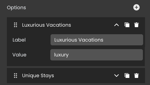
Option Duplication: Duplicate existing options to replicate configurations quickly by clicking on the
 icon.
icon.Option Removal: Delete options that no longer serve a purpose by clicking on the
 icon.
icon.Moving Option: Arrange options to your preferred position by clicking on the
 icon
icon
Data Integration
The Select Input component captures and reflects the user's choice within this set.
The Select Input component provides selections from a predefined set of options within the properties panel, without relying on datasources.
Data Binding
To associate data with the Select Input component, follow these steps:
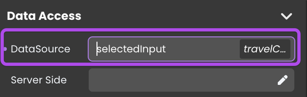
- Navigate to the Properties Panel: Access the Data Access category located within the Properties panel for the Select Input component.
- Define the Datasource: Specify the relevant Datasource that will capture the user's selected input.
Server-Side Interaction
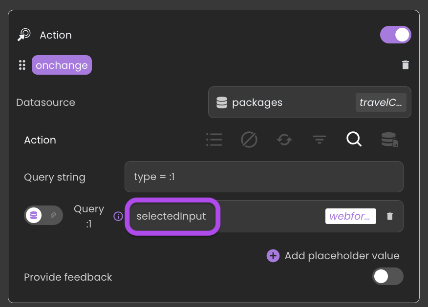
Retrieving user choices is straightforward. By binding a datasource to the Select Input component, you can access and utilize the selected content.
Consequently, you can utilize this option value in various ways, such as within a standard action to initiate a search with matching attribute values.
Additionally:
The Select Input component's datasource can also be linked to the value of an attribute in the currently selected entity of another datasource. This enables the component to automatically display the saved value of the selected option whenever a new entity is chosen.
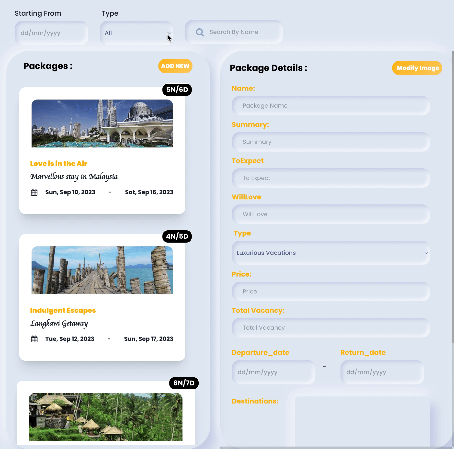
Showcase
Here's a glimpse of how the Select Input component will look and behave in action:
Triggers and Events
Select Input Component
The Select Input component can respond to various events, enabling dynamic user experiences. Events that can trigger actions within the component include:
| Event | Description |
|---|---|
| On Click | Calls for an action when the user clicks on the component. |
| On MouseEnter | Calls for an action when the user's mouse cursor enters the area of the component. |
| On MouseLeave | Calls for an action when the user's mouse cursor exits the area of the component. |
Embedded Select
The embedded Select can also respond to various events, allowing for dynamic user experiences. Events that can trigger actions within the embedded icon include:
| Event | Description |
|---|---|
| On Change | Calls for an action when the value of the Input changes. This typically occurs when the user enters or modifies text in the Input field. |
| On Click | Calls for an action when the user clicks on the Input. |
Embedded Label
The embedded Label can also respond to various events, allowing for dynamic user experiences. Events that can trigger actions within the embedded icon include:
| Event | Description |
|---|---|
| On Click | Calls for an action when the user clicks on the Label. |
| On Keyup | Calls for an action when a keyboard key is released while the Label is in focus |
| On KeyDown | Calls for an action when a keyboard key is pressed down while the Label is in focus. |
| On MouseEnter | Calls for an action when the user's mouse cursor enters the area of the Label. |
| On MouseLeave | Calls for an action when the user's mouse cursor exits the area of the Label. |