File Upload
The File Upload component is an interactive UI element that simplifies file transfers by allowing users to easily upload files to the server.
The File Upload component has an Icon element embedded within it. This is of great importance as configuring the File Upload component may require adjusting properties within the embedded element. This applies to the visual style, triggers, and actions as they may differ.
Use Cases
The File Upload component finds valuable application in diverse scenarios, including:
Document Management: Facilitate efficient document uploads and storage for improved organization.
Media Sharing: Allow users to upload images, videos, or audio files for seamless sharing with others.
File Archiving: Provide users with a means to securely store and retrieve essential files or records.
Properties Customization
File Upload Component
Enhance the File Upload component to align with your application's requirements using the following customization options:
- Label: Personalize the label to offer clear instructions or guidance.

- Icon Position: Choose the position of the icon in relation to the label, allowing options for top, bottom, left, right, or even hidden.

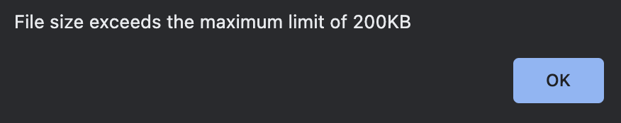
- Size Limit: Define the maximum file size users are allowed to upload. Choose from units such as KB, MB, and GB.
If a user attempts to upload a file exceeding the specified size, an error message is displayed in the browser.

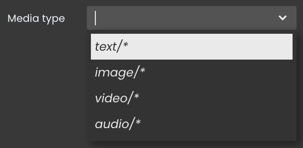
- Media Type: Specify the supported file types that can be uploaded using the component. Supported types include text, image, video, and audio.
Embedded Icon
Within the File Upload component, an embedded Icon allows for further customization of the following properties:
- Icon: When the icon visibility is configured in the File Upload component's customization properties, you can select an icon from an icon picker list.
Data Integration
The File Upload component uses data-binding to link user interactions with the underlying data structure.
The datasource for the File Upload component can take the form of either a Blob or a Picture.
Data Binding
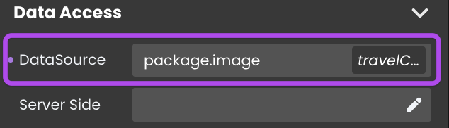
Alternatively, you can establish the connection by dragging and dropping the datasource onto the File Upload component.
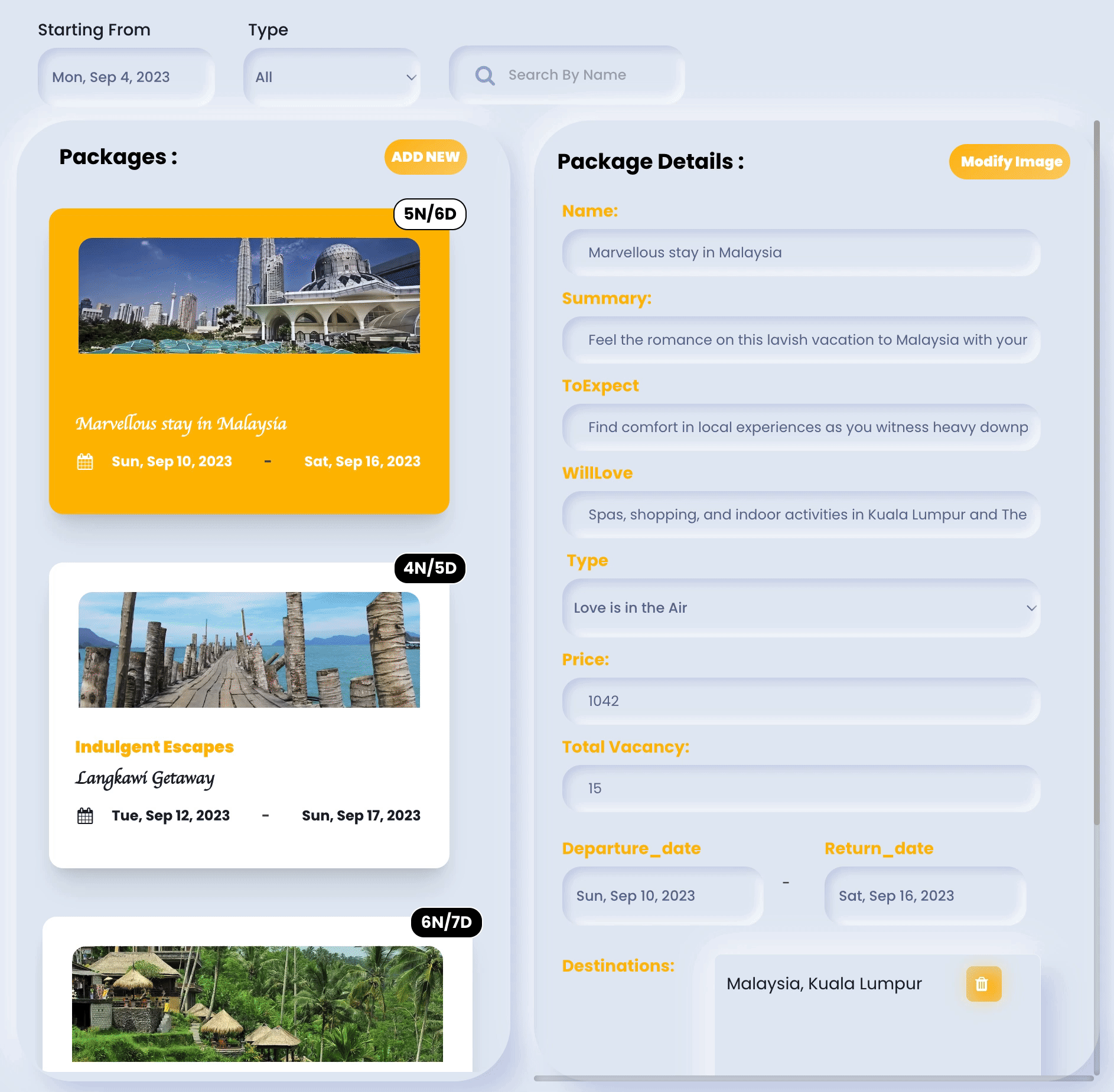
Showcase
Here's a glimpse of how the File Upload component will look and behave in action:
Triggers and Events
File Upload Component
The File Upload component can respond to various events, enabling dynamic user experiences. Events that can trigger actions within the component include:
| Event | Description |
|---|---|
| On Click | Calls for an action when the user clicks on the component. |
| On Blur | Calls for an action when the component loses focus (user clicks outside). |
| On Focus | Calls for an action when the component gains focus (user clicks on it). |
| On MouseEnter | Calls for an action when the user's mouse cursor enters the area of the component. |
| On MouseLeave | Calls for an action when the user's mouse cursor exits the area of the component. |
| On KeyDown | Calls for an action when a keyboard key is pressed down while the component is in focus. |
| On Keyup | Calls for an action when a keyboard key is released while the component is in focus |
Embedded Icon
The embedded Icon can also respond to various events, allowing for dynamic user experiences. Events that can trigger actions within the embedded icon include:
| Event | Description |
|---|---|
| On Click | Calls for an action when the user clicks on the Icon. |
| On Keyup | Calls for an action when a keyboard key is released while the Icon is in focus |
| On KeyDown | Calls for an action when a keyboard key is pressed down while the Icon is in focus. |
| On MouseEnter | Calls for an action when the user's mouse cursor enters the area of the Icon. |
| On MouseLeave | Calls for an action when the user's mouse cursor exits the area of the Icon. |