Checkbox
The Checkbox component is a UI element designed for binary selections. It consists of a small box that can be checked (selected) or unchecked (deselected) by the user.
The Checkbox component contains an embedded Checkbox Input and a Label element. This is of great importance as configuring the Checkbox component may require adjusting properties within the embedded elements. This applies to the visual style, triggers, and actions as they may differ.
Use Cases
The Checkbox component serve various purposes in user interfaces, including:
Feature Control: Enable/disable features.
Preference Indication: Reflect user preferences.
Agree/Disagree Choices: Obtain user consent.
Properties Customization
Checkbox Component
Enhance the Checkbox component to align with your application's requirements using the following customization options:
- Label Position: Developers can tailor the label's position, placing it above, below, to the left, to the right, or even hidden.

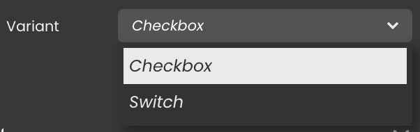
Variant Selection: Choose the variant that aligns with your design:
- Checkbox Variant: Select this for the standard checkbox style.
- Switch Variant: Choose this for a switch-like appearance.
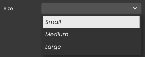
- Size: Choose from small, medium, or large sizes for the Checkbox component.
Embedded Label
Within the Checkbox component, an embedded Label allows for further customization of the following properties:
- Label: Personalize the label to offer clear instructions or guidance.

Data Integration
The Checkbox component allows for seamless integration of datasources, enabling dynamic data binding and interaction within the webform.
The datasource for the Checkbox component should be binary, with values limited to true or false.
Data Binding
To associate data with the Checkbox component, follow these steps:
Navigate to the Properties Panel: Access the Data Access category located within the Properties panel for the Checkbox component.
Define the Datasource: Specify the relevant Datasource that will capture the user's selected choice.
Alternatively, you can establish the connection by dragging and dropping the datasource onto the Checkbox component.
Server-Side Interaction
Interacting with user input data is straightforward. When you bind a datasource to the Checkbox component, you can access and make use of the input content.
Subsequently, you can utilize this input value in various ways, such as within a standard action to initiate a search with matching attribute values.
Triggers and Events
Checkbox Component
The Checkbox component can respond to various events, enabling dynamic user experiences. Events that can trigger actions within the component include:
| Event | Description |
|---|---|
| On Click | Calls for an action when the user clicks on the component. |
| On Blur | Calls for an action when the component loses focus (user clicks outside). |
| On Focus | Calls for an action when the component gains focus (user clicks on it). |
| On MouseEnter | Calls for an action when the user's mouse cursor enters the area of the component. |
| On MouseLeave | Calls for an action when the user's mouse cursor exits the area of the component. |
Embedded Label
The embedded Label can also respond to various events, allowing for dynamic user experiences. Events that can trigger actions within the embedded icon include:
| Event | Description |
|---|---|
| On Click | Calls for an action when the user clicks on the Label. |
| On Keyup | Calls for an action when a keyboard key is released while the Label is in focus |
| On KeyDown | Calls for an action when a keyboard key is pressed down while the Label is in focus. |
| On MouseEnter | Calls for an action when the user's mouse cursor enters the area of the Label. |
| On MouseLeave | Calls for an action when the user's mouse cursor exits the area of the Label. |