Select Box
The Select Box component is a UI element for item selection from a list of embedded Stylebox components. It streamlines selection through a dropdown-style interface, sourcing display data from a datasource and allowing customization with multiple embedded components.
Categorized as part of iterative components, the Select Box facilitates user selections by iterating over a datasource.
The Select Box component is notable for its capacity to present complex options as a dropdown list using embedded components, distinguishing it from the Select Input component that offers less versatile option displays.
Use Cases
The Select Box component finds application in various scenarios where a single value needs to be selected from a predefined list. Common use cases include:
Employee Allocation: In resource management applications, the Select Box component can assist in assigning employees to projects or tasks by providing a dropdown list of available team members.
Task Priority Selection: When managing tasks within a backoffice application, users might need to assign priorities to tasks. The Select Box component can offer a dropdown list of priority levels, simplifying the process of assigning importance to tasks.
Department Selection for Ticketing: In a support ticketing system, users can choose the department or category to which a ticket belongs. The Select Box component streamlines this process by offering a dropdown menu of available departments, ensuring that tickets are routed to the appropriate team.
Properties Customization
Enhance the Select Box component to align with your application's requirements using the following customization options:
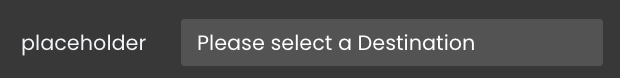
- Placeholder: Display a text as a dimmed placeholder in the select box.
- Number of items: Specify the maximum number of items to display simultaneously in the component.
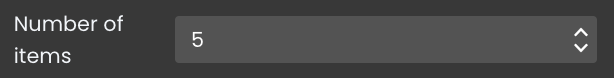
The select box can display a maximum of 15 items.
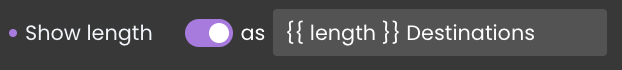
- Show length: Adds a string indicating the total number of items within the component. You can customize this pattern to suit your requirements, ensuring users have a clear understanding of the available options.
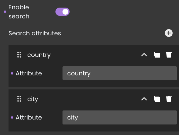
- Enable search: Adds a search area to the top of the component. This empowers users to filter the displayed options by entering specific characters. Developers have the flexibility to define the datasource attribute(s) to be searched within, enhancing the efficiency of option discovery.
Data Integration
The Select Box component is data-bound, meaning it relies on an external data source to populate its options. This allows the component to display and interact with data.
The datasource for the Select Box component can take the form of either an ORDA entity selection or a collection.
Data Binding
To associate data with the Select Box component, follow these steps:
- Navigate to the Properties Panel: Access the Data Access category located within the Properties panel for the Select Box component.
- Define the Datasource: Specify the appropriate Datasource that contains the data you want to display within the Select Box. For instance, you can select an entity selection, such as the
Destinationdataclass.
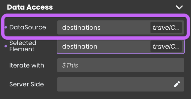
Alternatively, you can establish the connection by dragging and dropping the datasource onto the Select Box component.
Data Display
To associate data iterated over a datasource, you can follow these additional steps:
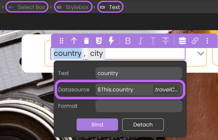
Access the Select Box: Within the Select Box component, locate the embedded Stylebox.
Add a Component: Add a Text component or other relevant components within the Stylebox.
Configure the Component: Click on the component you've added to enter its editing mode. The process of configuring components varies based on their type:
a. Toggle Datasource: Prepare to connect the component to the datasource in the next step by using the
Toggle Datasourcebutton.b. Properties Panel: In the next step, you'll configure them through the
Data Accesscategory in the Properties panel.
- Choose the Iterator: Choose the iterator corresponding to the iterated data (e.g.,
$This) to represent the current data item. - Choose the Attribute: Once you've selected the iterator, choose the specific attribute that you want to display within the component. This could be attributes like the name of the destination, the country, or any other relevant information.
Dynamic Attribute Display
Select Box component can link its currently selected entity to a datasource in the Selected Element field. This feature allows the component to automatically display the attributes of the selected element whenever a new entity is chosen.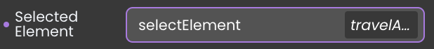
Text component, to display the corresponding attribute values.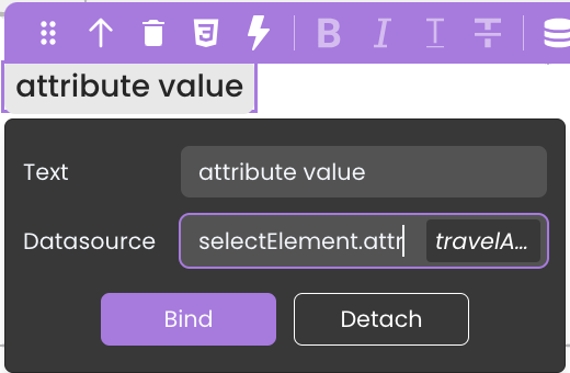
For more information, see the Iterative components section.
Server-Side Interaction
You can associate functions with embedded components in the Select Box component using $This. This capability enables the execution of functions from the entity class of the datasource that is providing data and being iterated upon in response to event triggers, such as button clicks.
To implement this functionality, follow these steps:
- Integrate the Select Box component into the interface.
- Select a datasource for the Select Box.
- Embed a component (e.g., a button) within the Select Box for each iterated data.
- Bind the desired function to the component's event, such as a button click, using
$This.
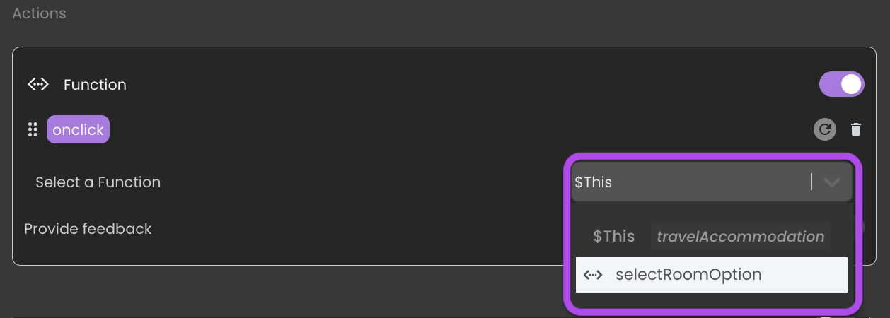
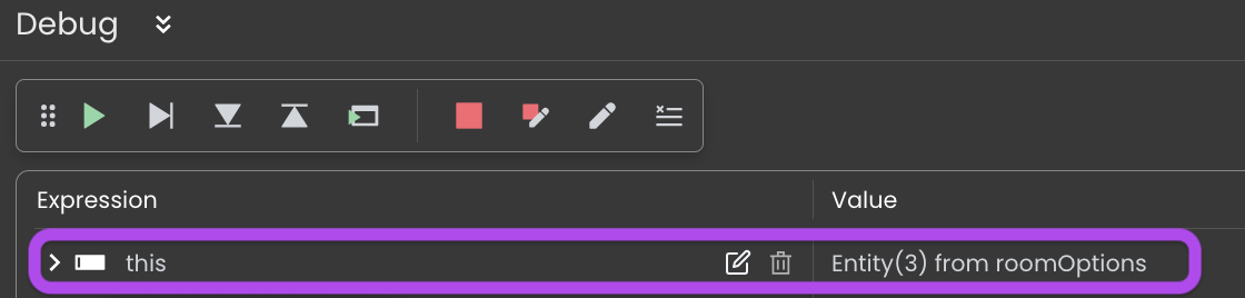
- In the code editor, within the function, you can directly retrieve the data of the currently selected element without the need to pass the selected element datasource as a parameter to the function.
Showcase
Here's a glimpse of how the Select Box component will look and behave in action:

Triggers and Events
The Select Box component can respond to various events, enabling dynamic user experiences. Events that can trigger actions within the component include:
| Event | Description |
|---|---|
| On Click | Calls for an action when the user clicks on the component. |
| On Select | Calls for an action when an item within the component is selected. |