Matrix
The Matrix component is a UI element designed to display a dynamic array of Stylebox components.
Categorized under iterative components, the Matrix component is specialized in showcasing dynamic arrays of Stylebox components based on the component's designated datasource.
Upon being placed on the canvas, the Matrix component includes a single Stylebox component, and this Stylebox is duplicated for each iteration of data.
Use Cases
The Matrix component finds application in various scenarios where data needs to be displayed iteratively and can be customized. Common use cases include:
Product Gallery: Create an interactive product gallery where each Stylebox represents a product with its image, name, and price.
News Feed: Design a dynamic news feed by using the Matrix component to iterate over news articles. Each Stylebox can display the headline and a brief excerpt.
User Profile Showcase: Build a user profile showcase where the Matrix iterates over user profiles, displaying profile images and usernames.
Properties Customization
Enhance the Matrix component to align with your application's requirements using the following customization options:
Orientation: Developers can choose between horizontal and vertical orientations for the Matrix. This choice affects the arrangement of Stylebox components and the presence of scrollbars.
- Vertical Orientation (Default): By default, the Matrix component is oriented vertically. This means that Stylebox components are stacked from top to bottom. If the content surpasses the defined height, a vertical scrollbar will automatically be shown, facilitating vertical scrolling to access all the content.
- Horizontal Orientation: When the Matrix component is configured with a horizontal orientation, Stylebox components are arranged from left to right. If the content exceeds the available width, a horizontal scrollbar will automatically appear, enabling users to scroll through the content horizontally.

Data Integration
The Matrix component is data-bound, meaning it relies on an external datasource to populate its options. This allows the component to display and interact with data.
The datasource for the Matrix component can take the form of either an ORDA entity selection or an array.
Data Binding
To associate data with the Matrix component, follow these steps:
- Navigate to the Properties Panel: Access the Data Access category located within the Properties panel for the Matrix component.
- Define the Datasource: Specify the appropriate Datasource that contains the data you want to display within the Matrix. For instance, you can select an entity selection from a relevant dataclass, such as
roomSelection.
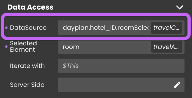
Alternatively, you can establish the connection by dragging and dropping the datasource onto the Matrix component.
Data Display
To display data iterated over a datasource, you can follow these additional steps:
Access the Matrix: Within the Matrix component, locate the embedded Stylebox.
Add a Component: Add a Text component or other relevant components within the Stylebox.
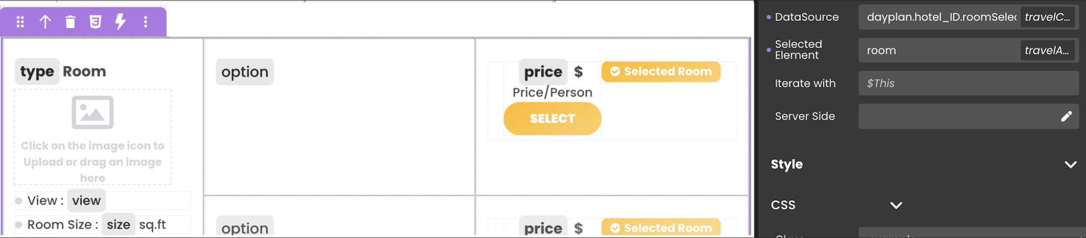
Configure the Component: Click on the component you've added to enter its editing mode. The process of configuring components varies based on their type:
Toggle Datasource: Prepare to connect the component to the datasource in the next step by using the
Toggle Datasourcebutton.Properties Panel: In the next step, you'll configure them through the
Data Accesscategory in the Properties panel.
Choose the Iterator: Choose the iterator corresponding to the iterated data (e.g.,
$This) to represent the current data item.
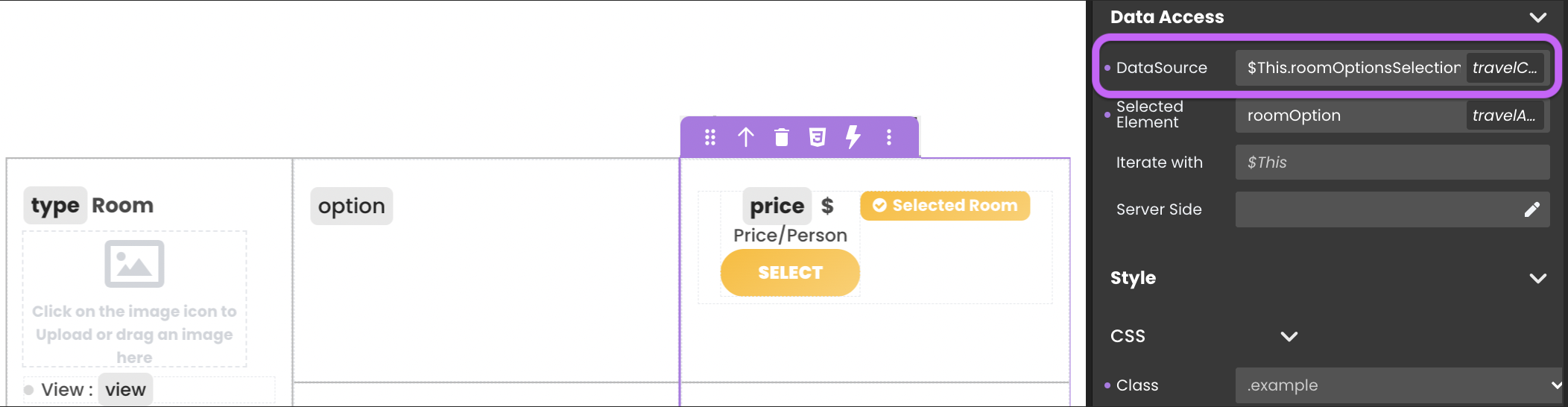
Choose the Attribute: Once you've selected the iterator, choose the specific attribute that you want to display within the component. This could include related entity selections. For example, use an embedded Matrix within the same Matrix to present various choices like room options (with/without breakfast).
Dynamic Attribute Display
Matrix component can link its currently selected entity to a datasource in the Selected Element field. This feature allows the component to automatically display the attributes of the selected element whenever a new entity is chosen.
Text component, to display the corresponding attribute values.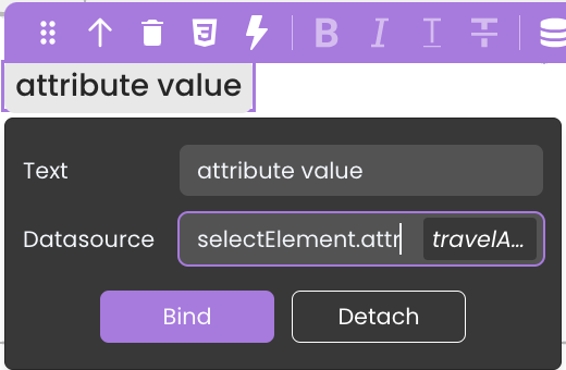
Server-Side Interaction
You can associate functions with embedded components in the Matrix component using $This. This capability enables the execution of functions from the entity class of the datasource that is providing data and being iterated upon in response to event triggers, such as button clicks.
To implement this functionality, follow these steps:
- Integrate the Matrix component into the interface.
- Select a datasource like
Roomsfor the Matrix. - Embed a component (e.g., a button) within the Matrix for each iterated data.
- Bind the desired function, like
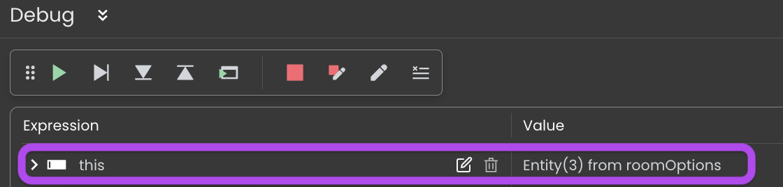
selectRoomOption, to the component's event, such as a button click, using$This. - In the code editor, within the function, you can directly retrieve the data of the currently selected element without the need to pass the selected element datasource as a parameter to the function.
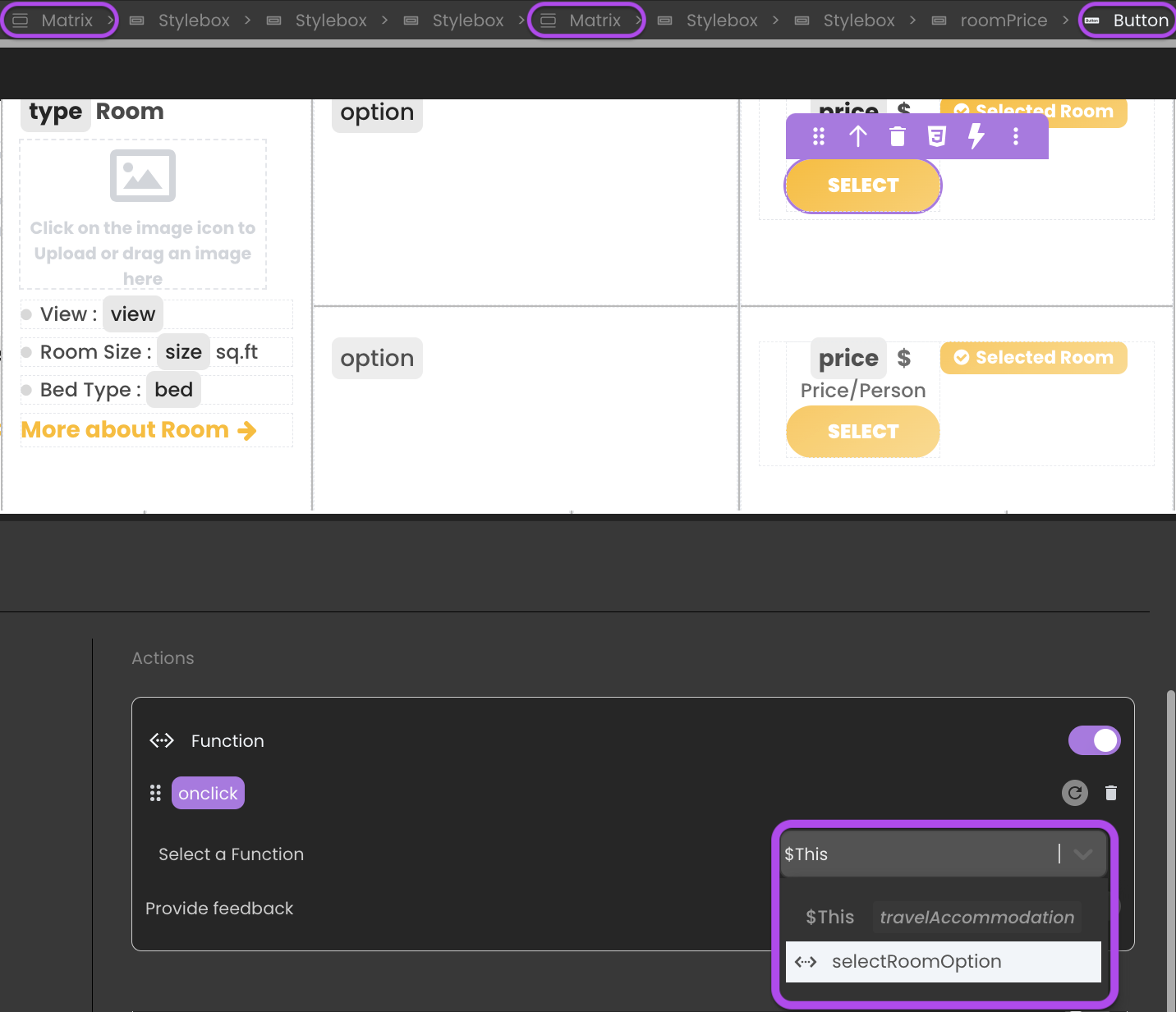
The same principle applies to Related Entity Interaction when you have embedded Matrices within the primary Matrix to manage each iterated data. You can link the intended function to the embedded Matrix's component event using $This.
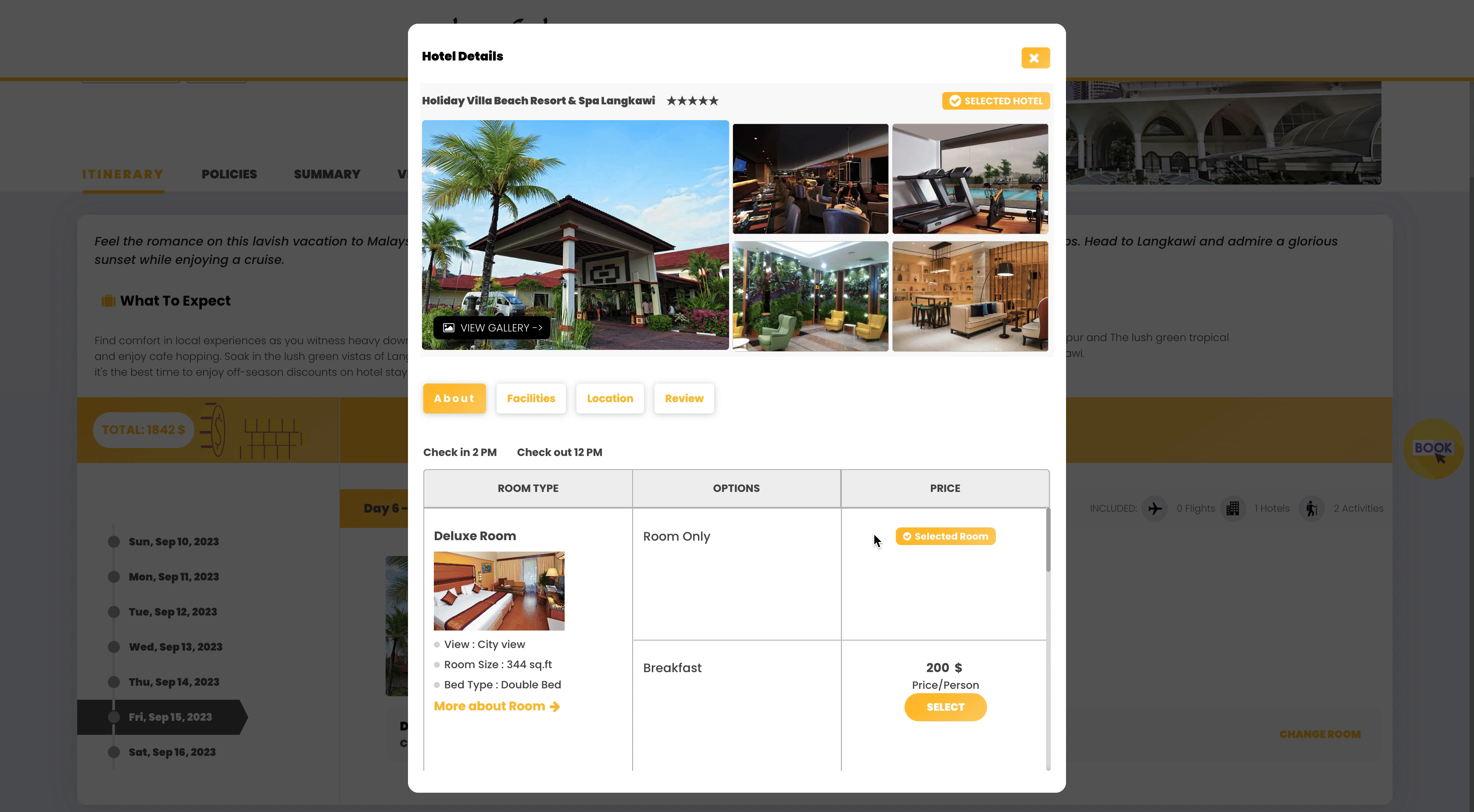
Showcase
Here's a glimpse of how the Matrix component will look and behave in action:
Triggers and Events
The Matrix component can respond to various events, enabling dynamic user experiences. Events that can trigger actions within the component include:
| Event | Description |
|---|---|
| On Click | Calls for an action when the user clicks on the component. |
| On Keyup | Calls for an action when a keyboard key is released while the component is in focus |
| On KeyDown | Calls for an action when a keyboard key is pressed down while the component is in focus. |
| On MouseEnter | Calls for an action when the user's mouse cursor enters the area of the component. |
| On MouseLeave | Calls for an action when the user's mouse cursor exits the area of the component. |
| On Select | Calls for an action when an item within the component is selected. |