Upload Custom Component
Overview
Qodly Studio offers an upload functionality to enhance the user experience and streamline the integration of custom components. This feature enables users to upload components generated using the npm run build command.
Community's Custom Components
The Qodly developer community is actively expanding, with members continuously crafting innovative custom components. These components are generously shared for free download within the community. If you're interested in contributing your custom components to this collective effort, we invite you to do so on the Custom Components for Qodly Studio page.
Uploading Custom Component
 button in the Component bar, allowing users to upload custom components. Hovering over the button displays a tooltip with the text "Upload Component".
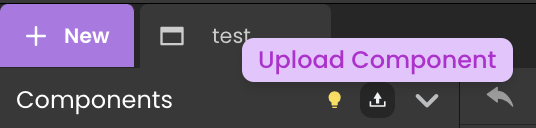
Clicking the button opens a popup with two upload methods:
- Users can drag and drop a component file onto the designated area within the popup.
- Alternatively, users have the option to select a component file from their computer using a file explorer.


Attempting to drop a file in a format other than ".zip" leaves the popup unaffected.
Installing Custom Component
 is displayed, indicating that the selected component is undergoing the upload process.
Clicking the "Cancel" button closes the upload interface, ensuring that no component is uploaded.


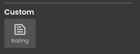
If no specific icon is defined for the custom component, the default icon is displayed alongside the component name.

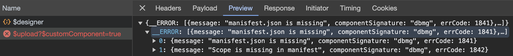
To check relevant details about the error and address the issue, inspect the network activity in the browser console. The upload request will display precisely what the error is.
Integration Process
This process involves the creation of a dedicated
CustomComponents folder within the Shared directory in the Explorer panel, containing relevant metadata and the uploaded custom components.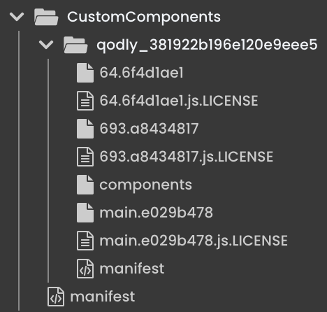
Manifest File Generation
Within the CustomComponents folder, a manifest.json file is generated, serving as a configuration document with information about the uploaded custom component.
[
   {
      "scope": "qodly_381922b196e120e9eee5",
      "author": {
         "name": "Qodly Team",
         "email": "contact@qodly.com",
         "url": "https://qodly.com"
      },
      "module": "components",
      "remoteEntryFileName": "components.js",
      "url": "/$shared/CustomComponents/qodly_381922b196e120e9eee5/"
   }
]
Component Folder Creation
Simultaneously, a folder is created with a name corresponding to the unique ID of the uploaded custom component. This folder encompasses various essential files, including JavaScript files and licenses dedicated to the custom component:
64.6f4d1ae1: This file contains minified JavaScript code associated with the definition of the React component "ExampleComponent". It encompasses settings, component structure, event handling, and other functionalities crucial to the behavior of the component.
64.6f4d1ae1.js.LICENSE: This file contains licensing information for the JavaScript file "64.6f4d1ae1". It provides details regarding the license under which the code is distributed.
693.a8434817: This file holds minified JavaScript code responsible for defining various functions or features within the component. It plays a role in enhancing the overall functionality of the custom component.
693.a8434817.js.LICENSE: Licensing information specific to the JavaScript file "693.a8434817". It includes details about the license under which the code is distributed.
components: This file contains a minified and compressed file that encompasses functionality related to dynamic module loading, shared modules, dynamic script creation and loading, error handling, and references to Webpack chunks. It is crucial for efficient operation and integration of the custom component within Qodly Studio.
main.e029b478: A minified JavaScript file containing code related to the React component "ExampleComponent". It includes modules for a web form editor (@ws-ui/webform-editor) and the React library itself. The code defines and exports components, settings, and other functionality.
main.e029b478.js.LICENSE: Licensing information for the JavaScript file "main.e029b478". It includes details about the license under which the code is distributed.
manifest: The "manifest" file includes important metadata about the custom component