Text
The Text component is a UI element designed to display text content on webforms.
Use Cases
The Text component is capable of fulfilling various text display needs:
Static Text: Use it to display unchanging content such as instructions, labels, and consistent information.
Dynamic Content: The Text component is not limited to static text. It can display dynamic content pulled from your datasources. This dynamic feature allows you to show text that adapts and updates based on data values.
Properties Customization
Enhance the Text component to align with your application's requirements using the following customization options:
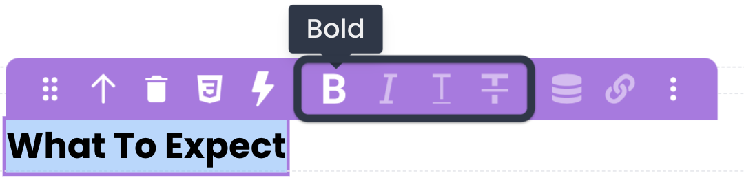
- Style Buttons: Apply various text styles such as Bold, Italic, Underline, and Strikethrough to the selected portion of text.
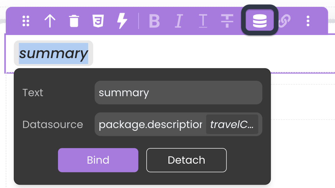
- Toggle DataSource: Bind the Text component's content to a datasource, making the text content dynamic and data-driven. By inserting a placeholder in the text on the canvas and specifying the datasource path (using keywords like
package.descriptionor$Thisin iterative components), you can dynamically populate the text content.
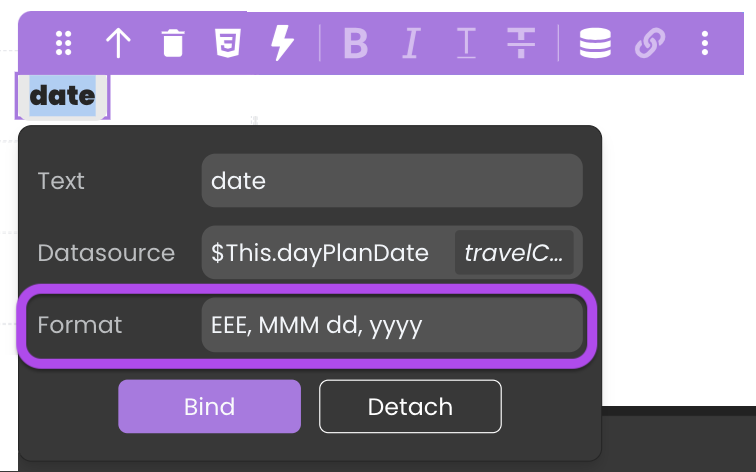
- Format Support: Depending on the chosen datasource, the Text component may offer format options to ensure the displayed data is presented in the desired manner like date formats. See Formats for a description of available formats.
- Toggle Link: Insert hyperlinks within the text content, binding them to specific text labels. You can choose whether the link opens in the same browser tab or a new tab. The link itself can be either a static URL or a dynamic value derived from datasources.
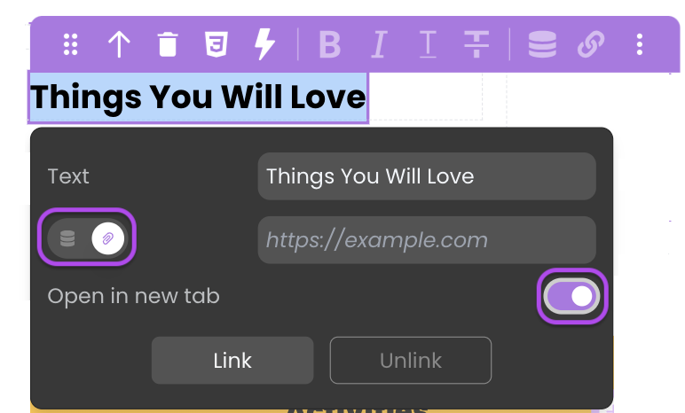
When the hyperlink directs to a file path within the Shared folder, it doesn't open in a new tab; instead, the browser triggers a download.
This follows the same concept as Navigate to Shared Folder Content through the External Link option.
Data Integration
The Text component is not limited to static text, it is also data-bound, which means it depends on a datasource to populate its options.
Data Binding
The Text component's content can be dynamically bound to datasources through the properties customization using the Toggle DataSource option.
Alternatively, you can establish the connection by dragging and dropping a datasource of type text, number, date, or duration onto the webform, resulting in the automatic addition of a Text component with the datasource bound to it.
Triggers and Events
The Text component can respond to various events, enabling dynamic user experiences. Events that can trigger actions within the component include:
| Event | Description |
|---|---|
| On Click | Calls for an action when the user clicks on the component. |
| On DblClick | Calls for an action when the user double-clicks on the component. |
| On MouseEnter | Calls for an action when the user's mouse cursor enters the area of the component. |
| On MouseLeave | Calls for an action when the user's mouse cursor exits the area of the component. |