Data Table
The DataTable component is a versatile UI element used to display data in a tabular format, resembling a table. It efficiently iterates through a designated datasource, converting it into an organized list comprising rows and columns. In the DataTable, columns represent attributes, rows represent entities, and a header row labels the columns.
Use Cases
The DataTable component proves invaluable across a multitude of scenarios where data needs to be comprehensively displayed, including:
Data Analysis: Utilize the DataTable to showcase datasets, enabling users to perform in-depth analysis, exploration, and comparison of various attributes.
Inventory Management: Employ the DataTable in inventory management systems to present product details, quantities, and availability.
Sales Reports: For tracking sales performance, the DataTable effectively displays revenue, product sales, and other relevant metrics.
Properties Customization
Enhance the DataTable component to align with your application's requirements using the following customization options:
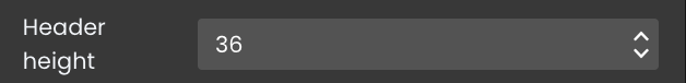
- Header Height: Define the height of the header row in pixels.
- Row Height: Set the height of each row (excluding the header) in pixels.

- Show Borders: Enable or disable the display of line and column borders within the DataTable.

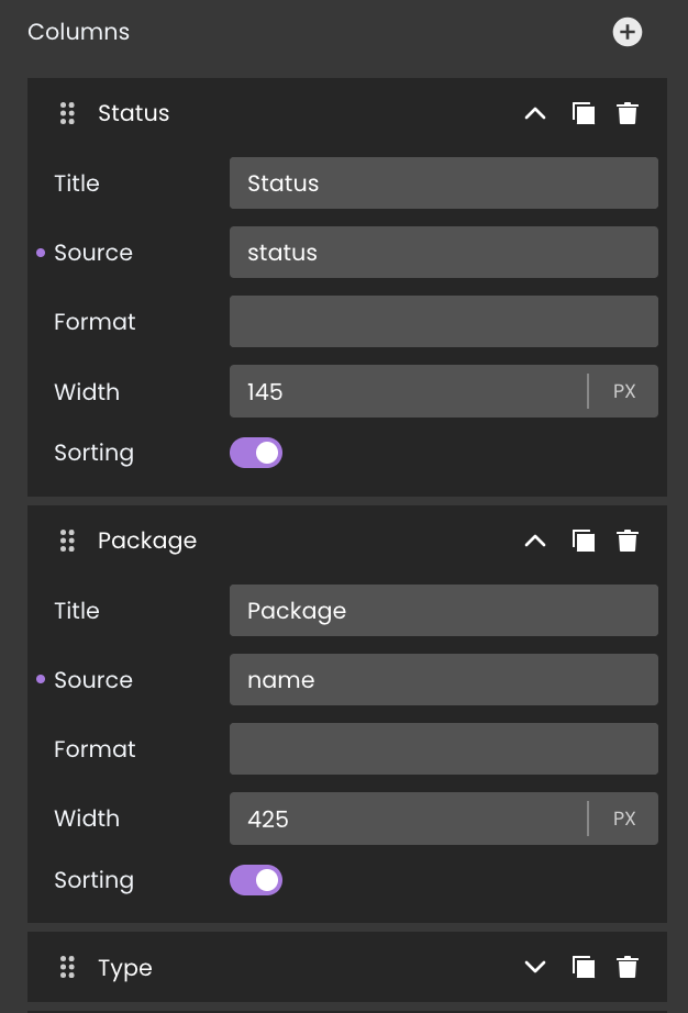
Columns Area: The columns area is where developers can manage the columns within the DataTable. It provides options for adding, moving, or removing columns to customize the structure of the table.
Adding Columns: To add a new column, click on the
+icon. This action triggers the appearance of a new column configuration area located at the bottom of the column list. This area allows you to define properties for the new column:- Title: The title is the text displayed in the header row as the label for the column. It also appears as the column name in the properties area.
- Source: The source attribute specifies the datasource for the column. Typically, it refers to an attribute whose value depends on each element of the DataTable's DataSource. This determines the content to be displayed in the column cells.
- Format: The format property allows you to define how the data in the column should be displayed, depending on its type. It specifies the visual representation of the data, such as date formatting or decimal places. See Formats for a description of available formats.
- Width: The width of the column can be customized. You have the option to define the width in pixels or as a percentage. The unit menu at the right side of the entry area lets you choose between PX (pixels) or % (percentage).
- Sorting: The sorting selector enables users to interactively sort the column. When this selector is activated, users can click on the header area of the column to perform ascending or descending sorting at runtime.
Column Duplication: Duplicate existing columns to replicate configurations quickly by clicking on the
 icon.
icon.Column Removal: Delete columns that no longer serve a purpose by clicking on the
 icon.
icon.Moving Column: Arrange columns to your preferred position by clicking on the
 icon
icon
Data Integration
The DataTable component is data-bound, meaning it relies on an external data source to populate its options. This allows the component to display and interact with data.
The datasource for the DataTable component can take the form of either an ORDA entity selection or an array.
Data Binding
To associate data with the DataTable component, follow these steps:
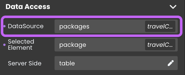
- Navigate to the Properties Panel: Access the Data Access category located within the Properties panel for the Data Table component.
- Define the Datasource: Specify the appropriate Datasource that contains the data you want to display within the DataTable. For instance, you can select an entity selection, such as the
Packagesdataclass.
Alternatively, you can establish the connection by dragging and dropping the datasource onto the DataTable component.
Data Display
When it comes to displaying columns in the DataTable component, you have two options:
Property Customization in the Columns Area: Modify column settings according to your preferences directly from the Columns Area.
Attribute Drag-and-Drop: Alternatively, you can include columns by dragging and dropping attributes from the datasource onto the DataTable.
Dynamic Attribute Display
Data Table component can link its currently selected entity to a datasource in the Selected Element field. This feature allows the component to automatically display the attributes of the selected element whenever a new entity is chosen.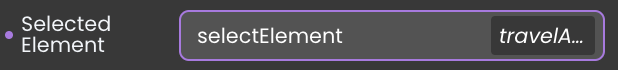
Text component, to display the corresponding attribute values.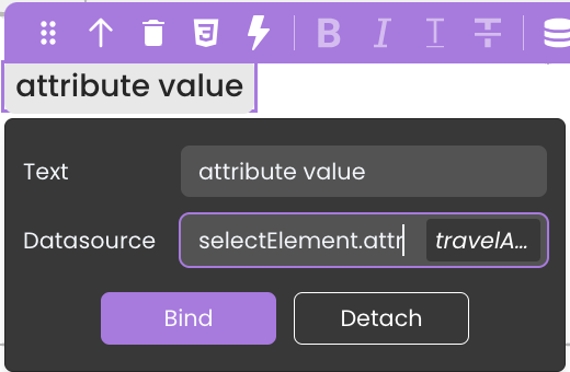
Server-Side Interaction
Enhance DataTable interactivity by binding functions to events like onheaderclick and oncellclick. These events respond to user actions and retrieve event-specific details using the webEvent command.
Common attributes for onheaderclick and oncellclick:
| Attribute | Type | Description |
|---|---|---|
| caller | Text | Server-side reference of the DataTable component. |
| data | Object | The data object containing event-specific information. |
| eventType | Text | Type of event that has been triggered ("onheaderclick" or "oncellclick") |
- onheaderclick: Triggered when a user clicks a column header. The data object attribute includes:
| Attribute | Type | Description |
|---|---|---|
| index | Number | The index of the clicked column header (starting from 0). |
| name | Text | The datasource of the column. |
- oncellclick: Triggered when a user clicks a cell in a row. The data object attribute includes:
| Attribute | Type | Description |
|---|---|---|
| index | Number | The index of the clicked column header (starting from 0). |
| name | Text | The datasource of the column. |
| row | Number | The number of the clicked row. |
User Experience Features
The DataTable component provides a range of user-friendly features:
Column Sorting: Users can sort data by clicking column headers
 .
.Resizable Columns: Adjust column widths to fit content
 .
.Drag-and-Drop Column Movement: Rearrange columns with ease
 .
.Selectable/Tabbable Rows: Navigate and select rows using keyboard tabbing.
Showcase
Here's a glimpse of how the DataTable component will look and behave in action:
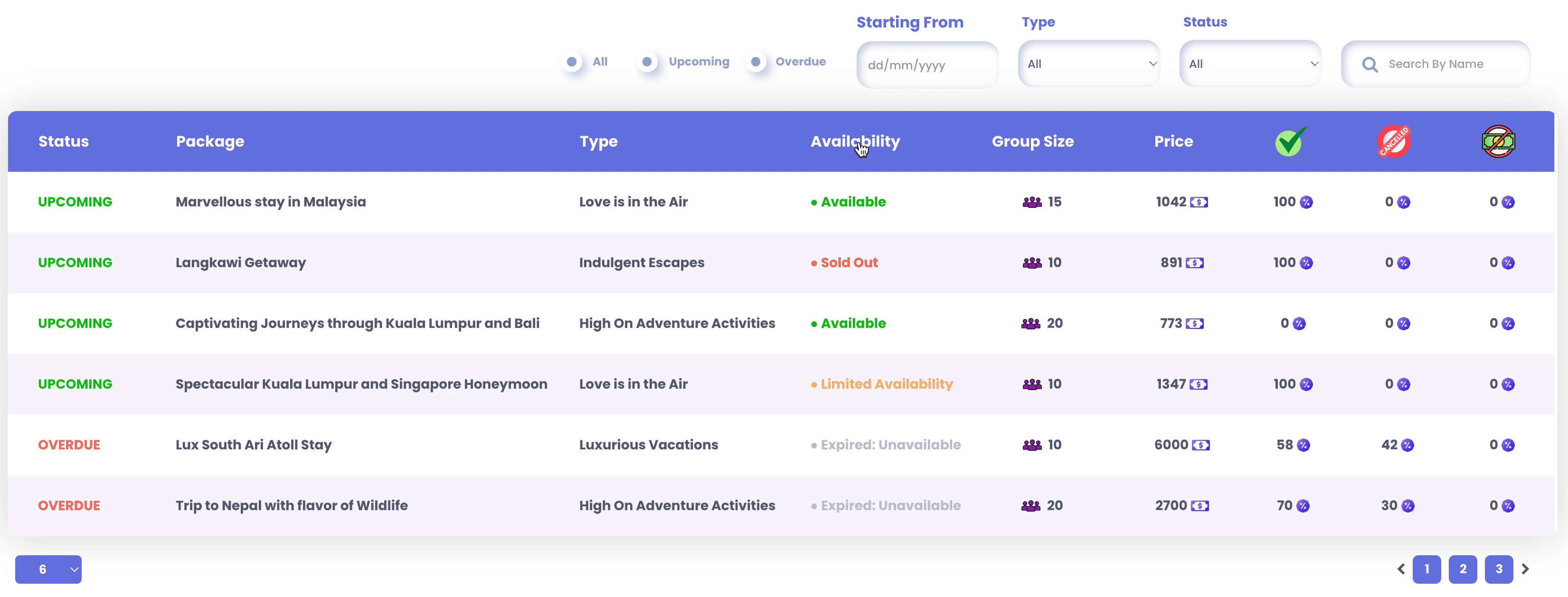
Customize the styles of the DataTable component by utilizing specific CSS classes that target various elements of the DataTable. For more details, refer to the section on Customizing DataTable Styles.
Triggers and Events
The DataTable component can respond to various events, enabling dynamic user experiences.
Additional information including the column number, row number, and column datasource name are returned by the webEvent command when called in an event function triggered by a DataTable component.
Events that can trigger actions within the component include:
| Event | Description |
|---|---|
| On Select | Calls for an action when an item within the component is selected. |
| On Click | Calls for an action when the user clicks on the component. |
| On DoubleClick | Calls for an action when the user double-clicks on the component. |
| On HeaderClick | Calls for an action when the user clicks on the header of a column. |
| On HeaderDoubleClick | Calls for an action when the user double-clicks on the header of a column. |
| On CellClick | Calls for an action when the user clicks on a cell within the component. |
| On CellDoubleClick | Calls for an action when the user double-clicks on a cell within the component. |
| On Keyup | Calls for an action when a keyboard key is released while the component is in focus |
| On KeyDown | Calls for an action when a keyboard key is pressed down while the component is in focus. |
| On CellMouseEnter | Calls for an action when the user's mouse cursor enters a cell within the component. |
| On MouseEnter | Calls for an action when the user's mouse cursor enters the area of the component. |
| On MouseLeave | Calls for an action when the user's mouse cursor exits the area of the component. |